Sumo Joe Studio / Work / Events
Tired Oats Club
- Client
- A music movement for the tired over-30s: daylife culture (hikes, shared tables, workshops, volunteering) under the line “Home by one”.
- Year
- 2025–2026
- What we did
- Brand identity
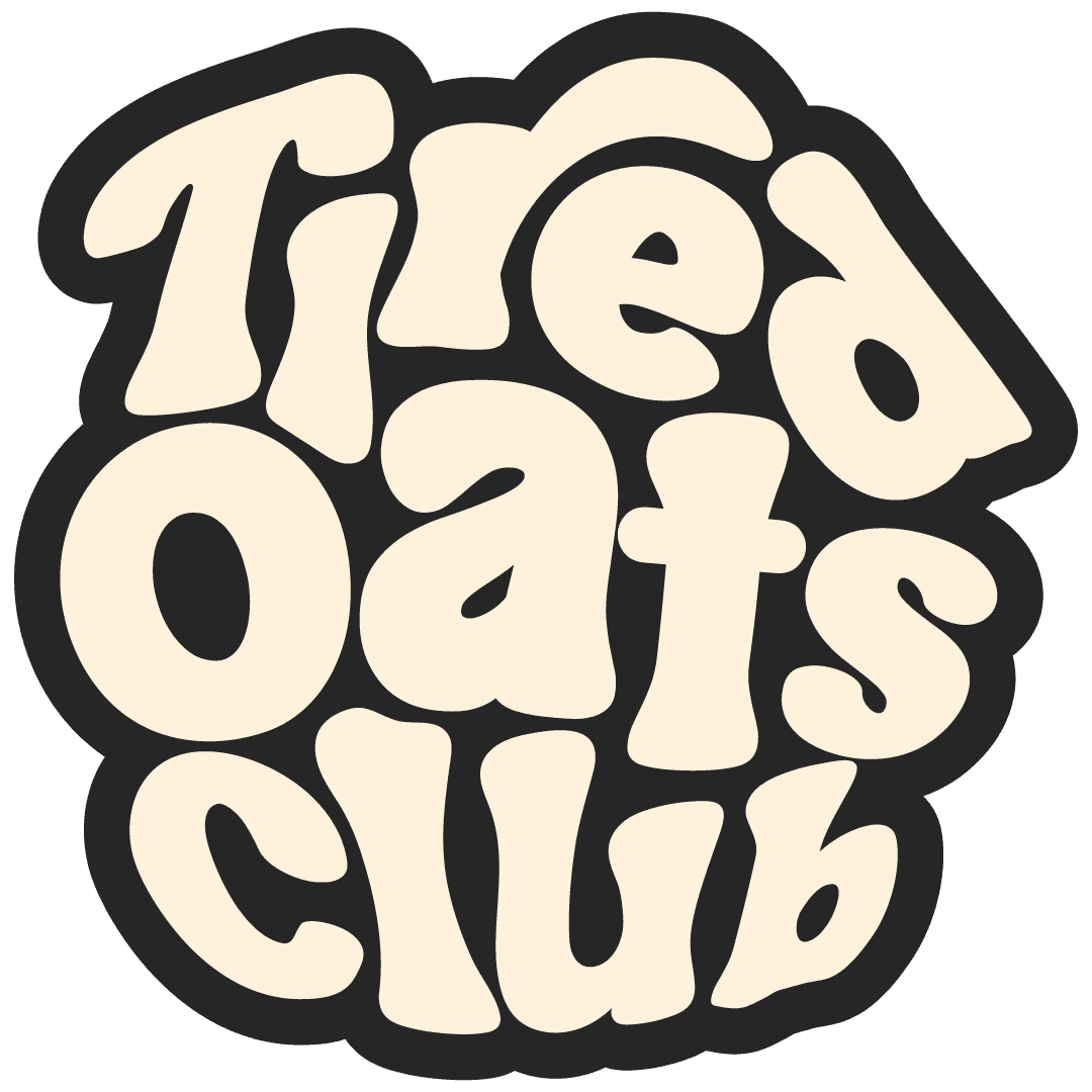
- Logo suite (core, stamp, tabs)
- Brand guidelines
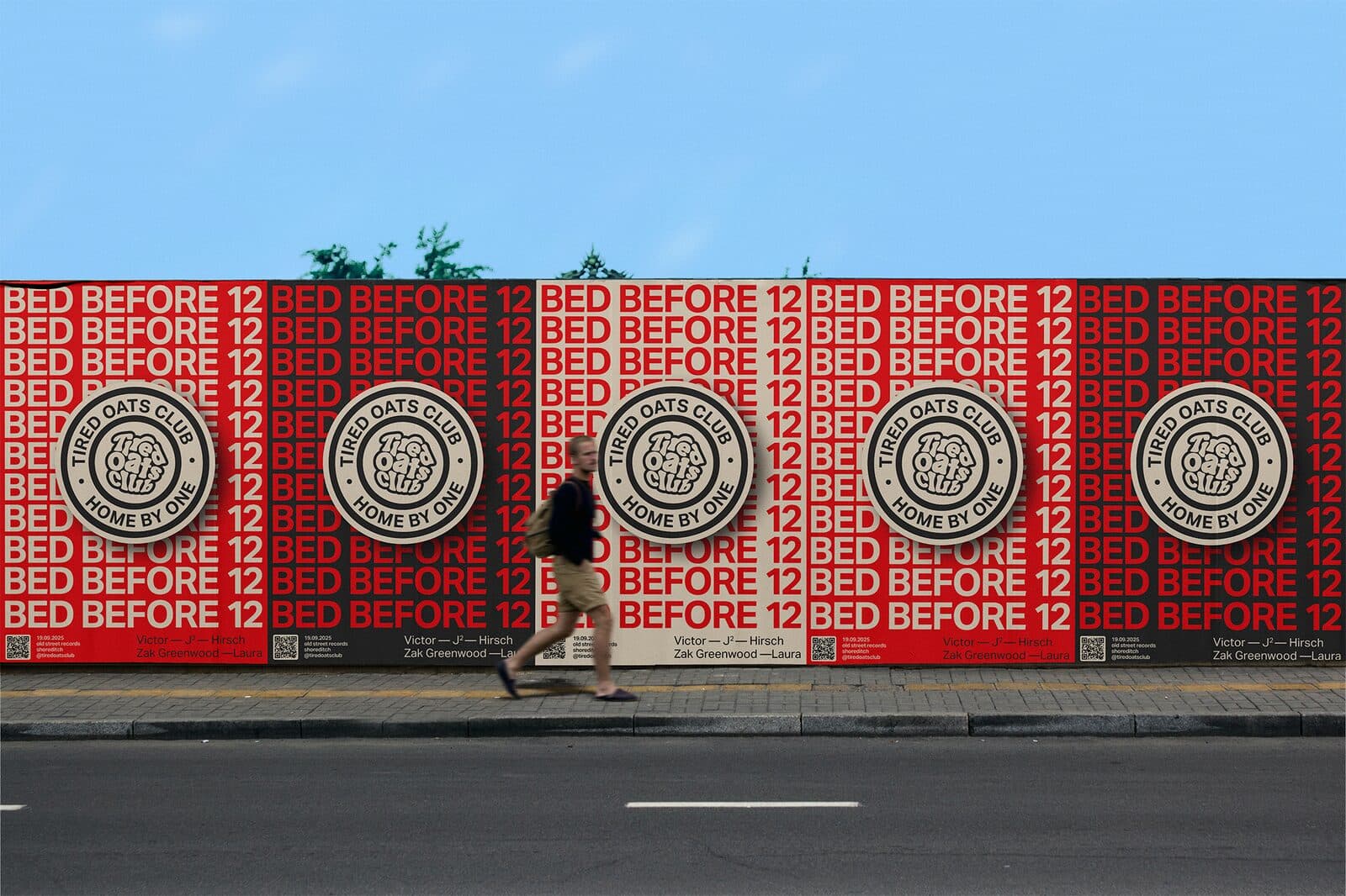
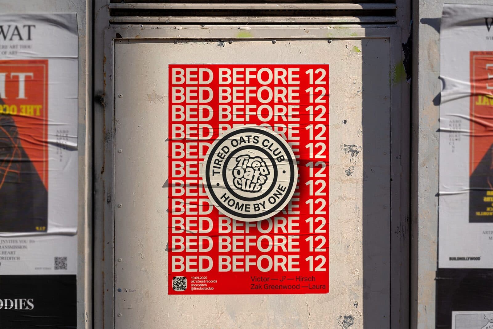
- Posters
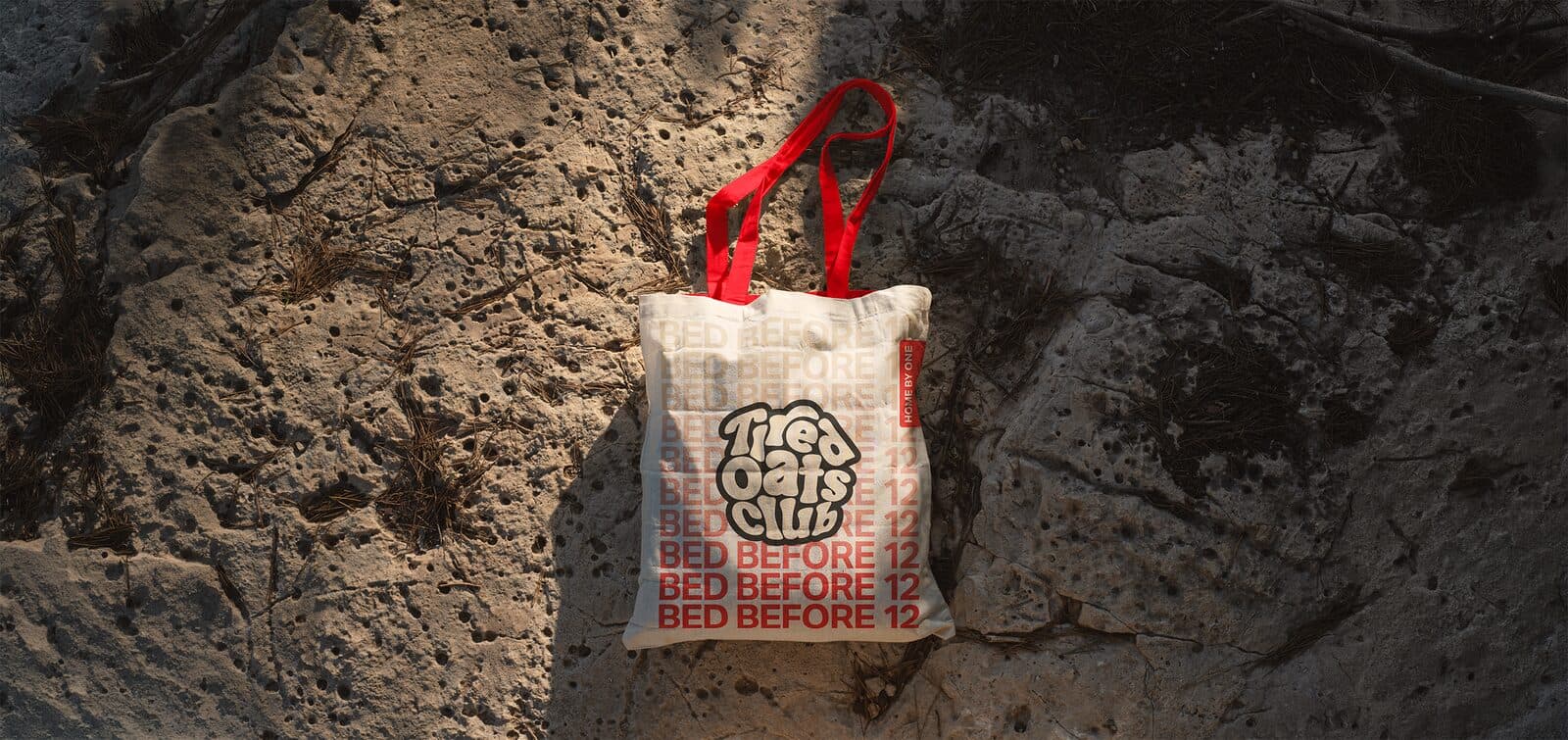
- Merch
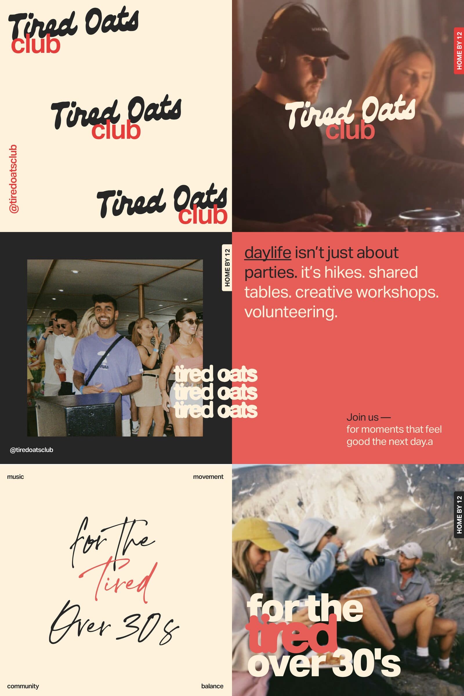
- Social
Following Tired Oats Club’s ethos of creating nightlife experiences that don’t compromise the day after, we developed a bold, modular visual identity that reflects the brand’s energy and reimagined daylife culture.
Stripping back to essentials, the system centres on confident typography, raw & expressive imagery and is designed to flex seamlessly across digital and physical touchpoints.
- Dark Grey #262626
- Off-White #FFF2DC
- Party Red #ED1C24
Type: Aktiv Grotesk, Iowan Old Style
Next: Mirabelle Events