Sumo Joe Studio / Work / Food
Bison Coffee
- Client
- Bison Coffee Company: coffee roasted in the heart of the Three Valleys, in the Alps, between Bozel and Courchevel.
- Year
- 2026
- What we did
- Logotype, logomark and lock-ups
- Colour palette
- Bespoke typeface (Bison Sans)
- Packaging
- Socials and ad style
- Posters
- Merch
- Art direction
- Brand guidelines
Bringing energy to the Alps
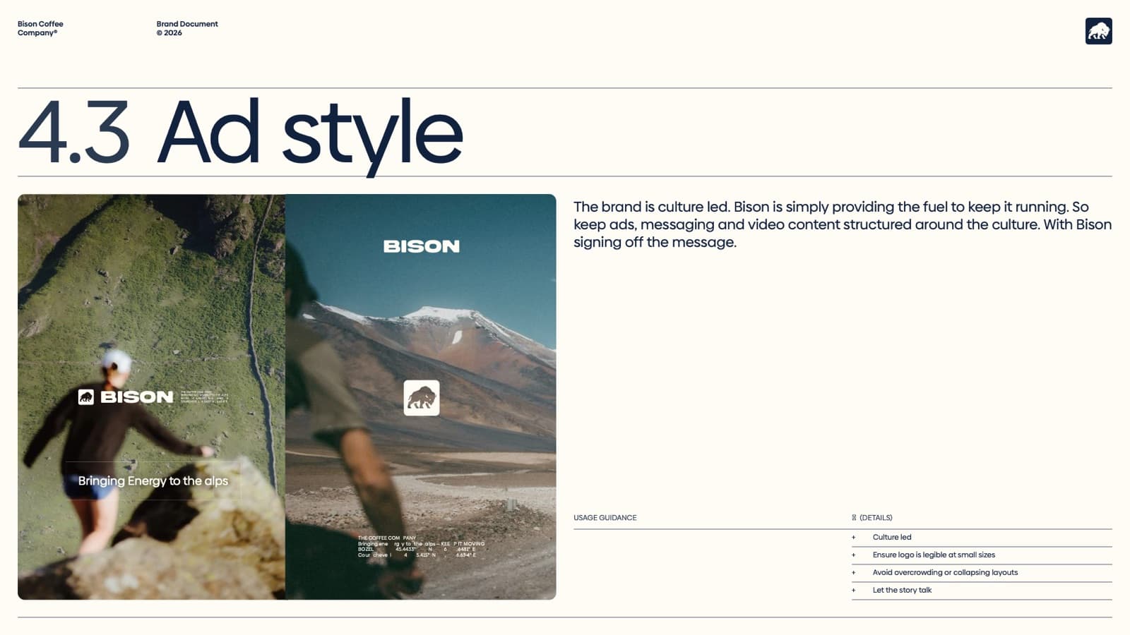
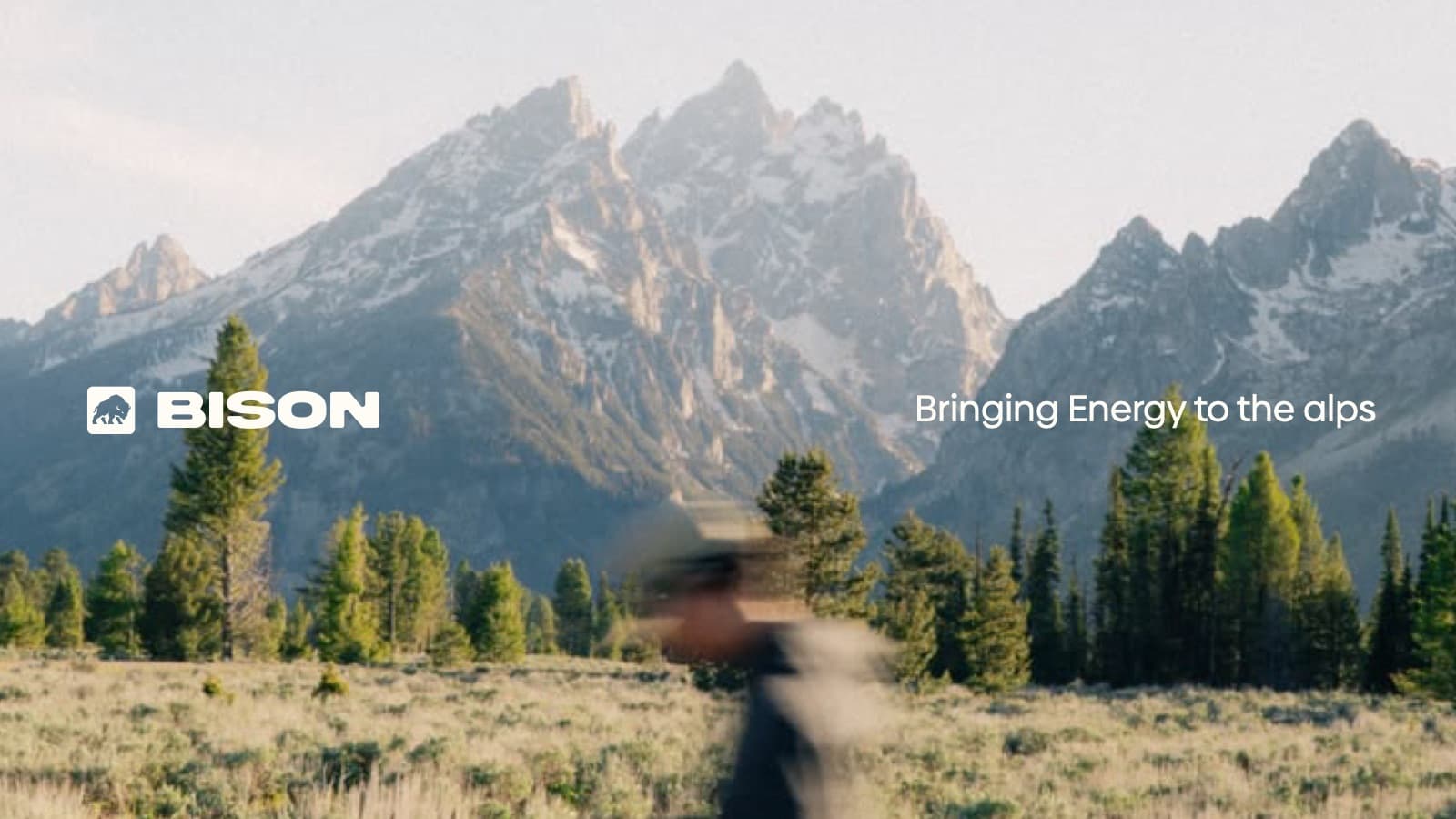
The brand is culture led. Bison is simply providing the fuel to keep it running. So the ads, messaging and video content are structured around the culture, with Bison signing off the message.
The guidelines set out the core identity (logo, colour, type, imagery and voice) and how to apply it across every touchpoint. Every element has a function. Every decision supports the system.
The logo
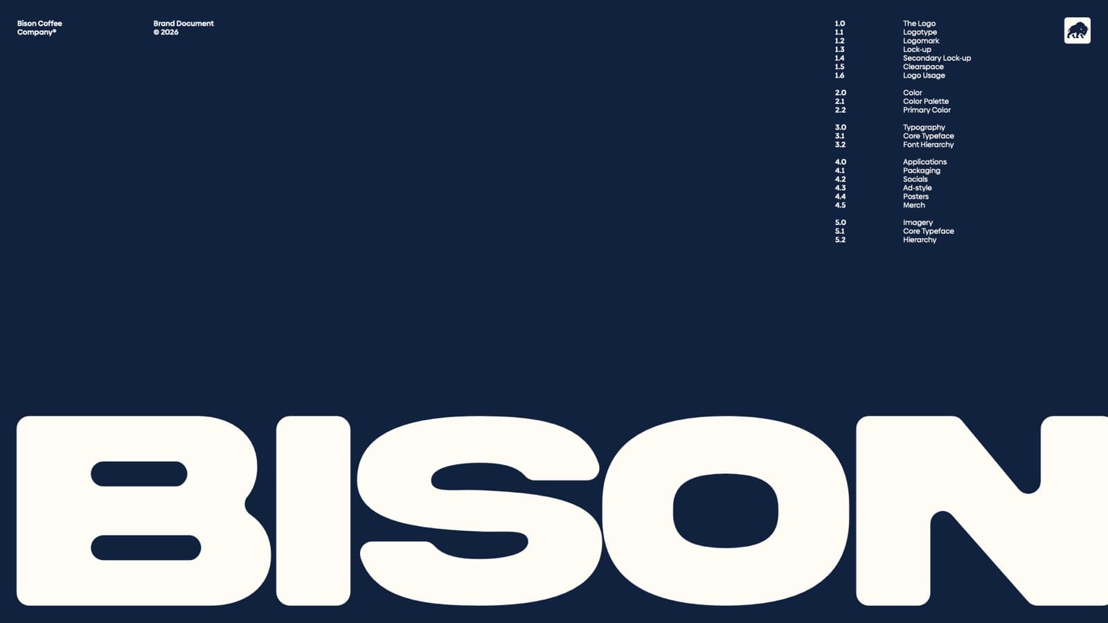
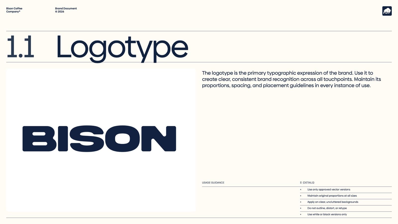
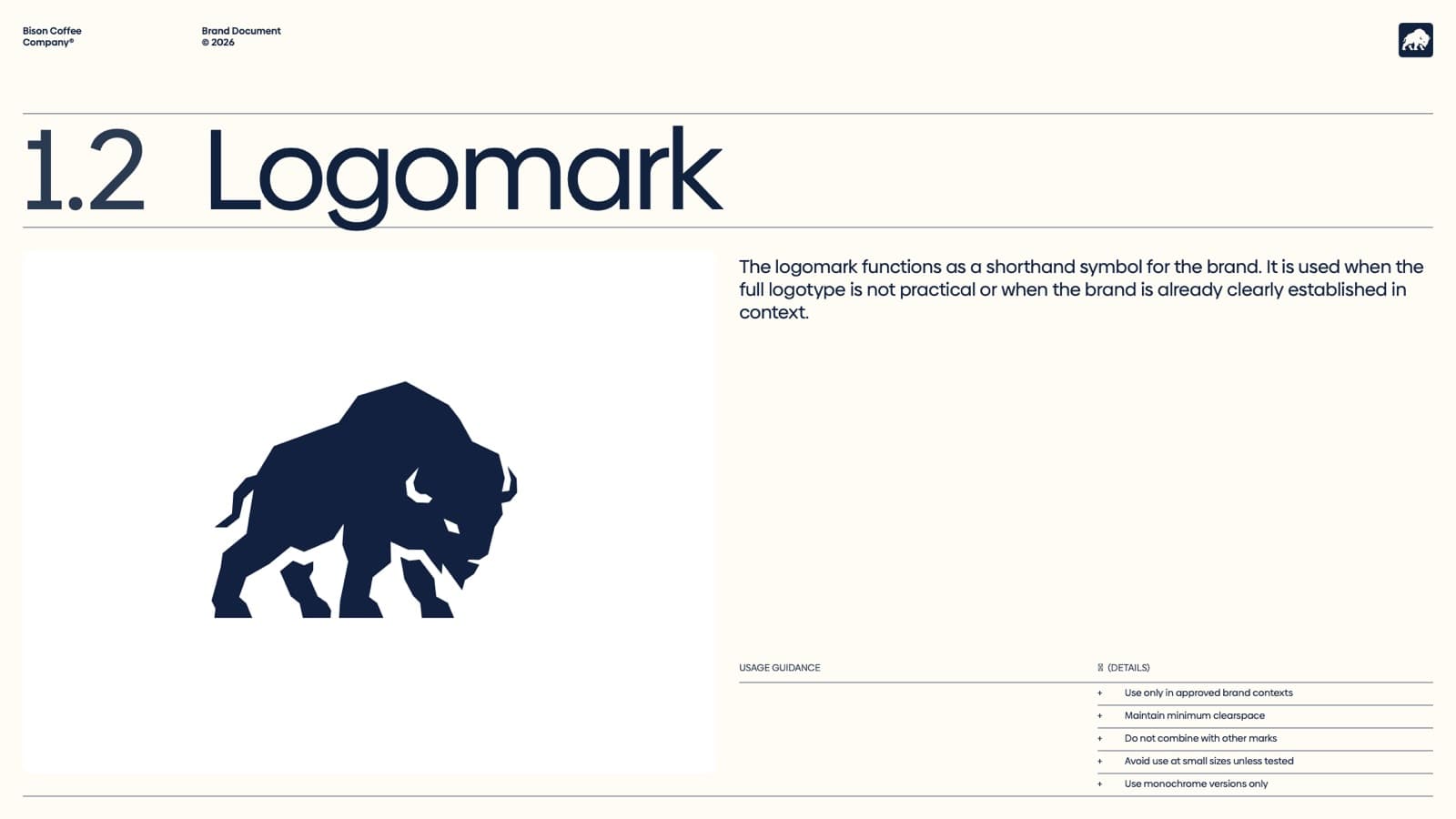
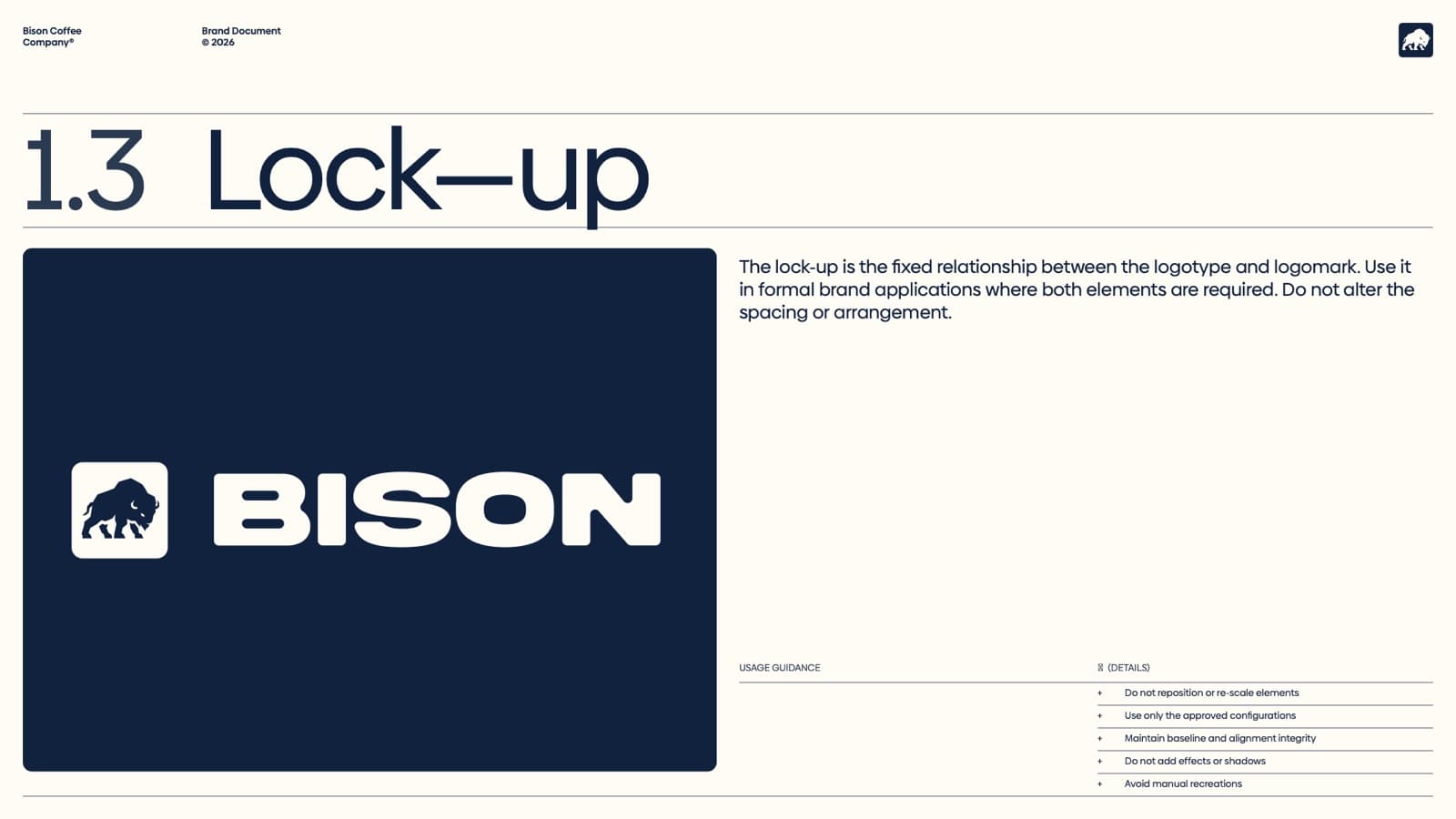
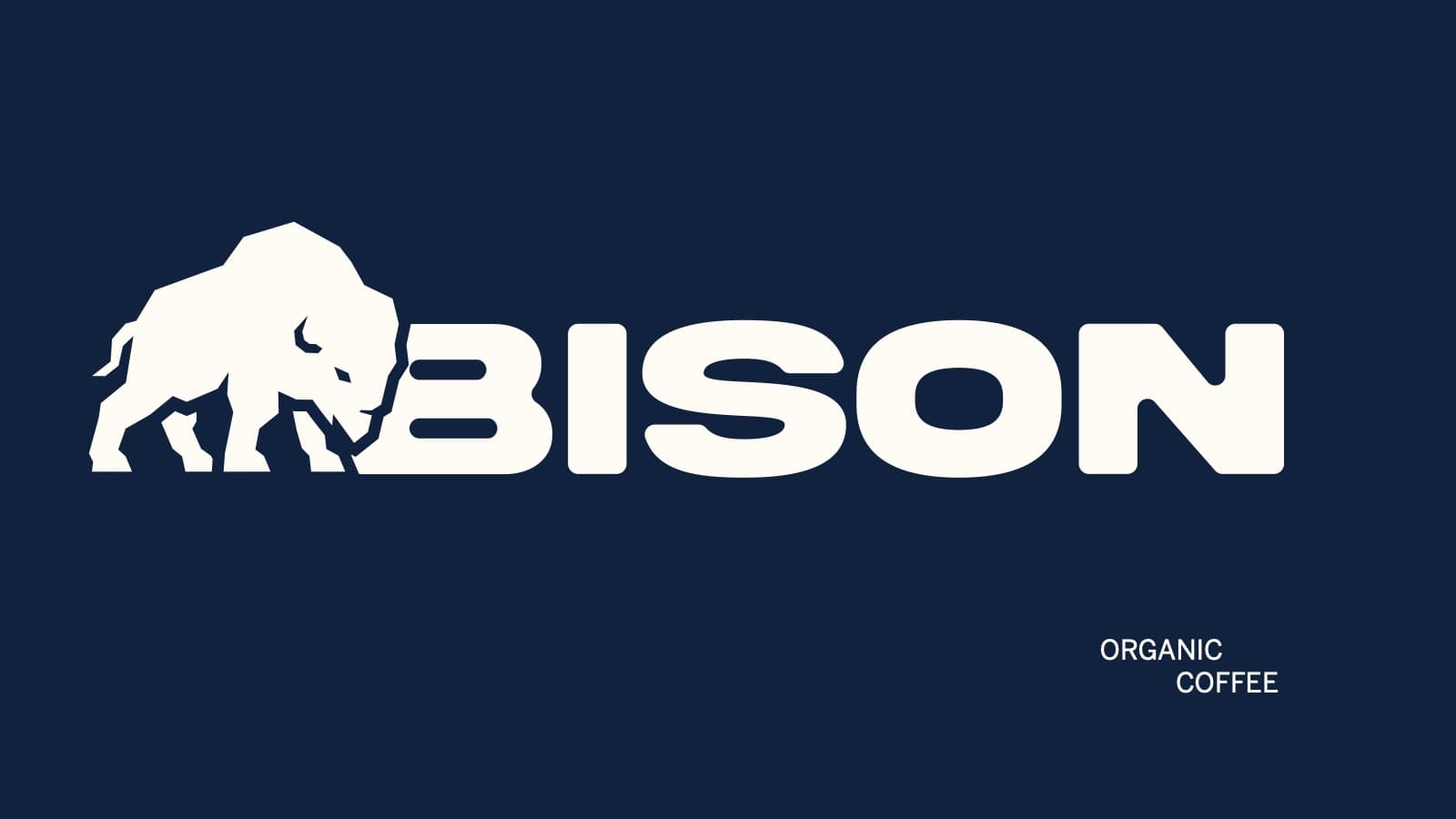
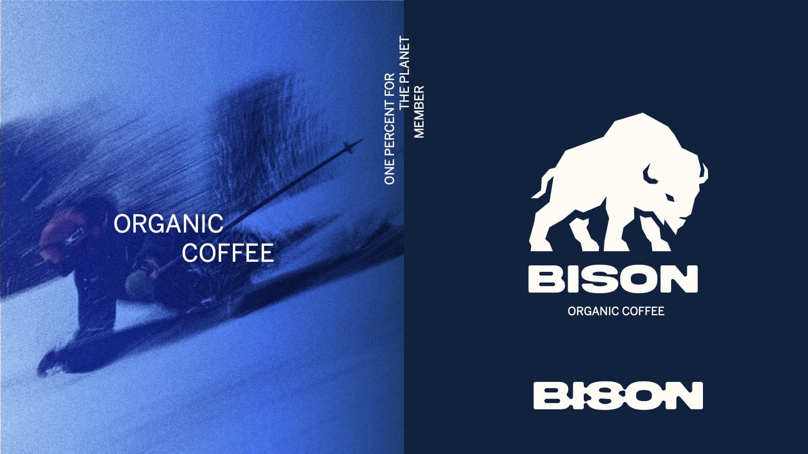
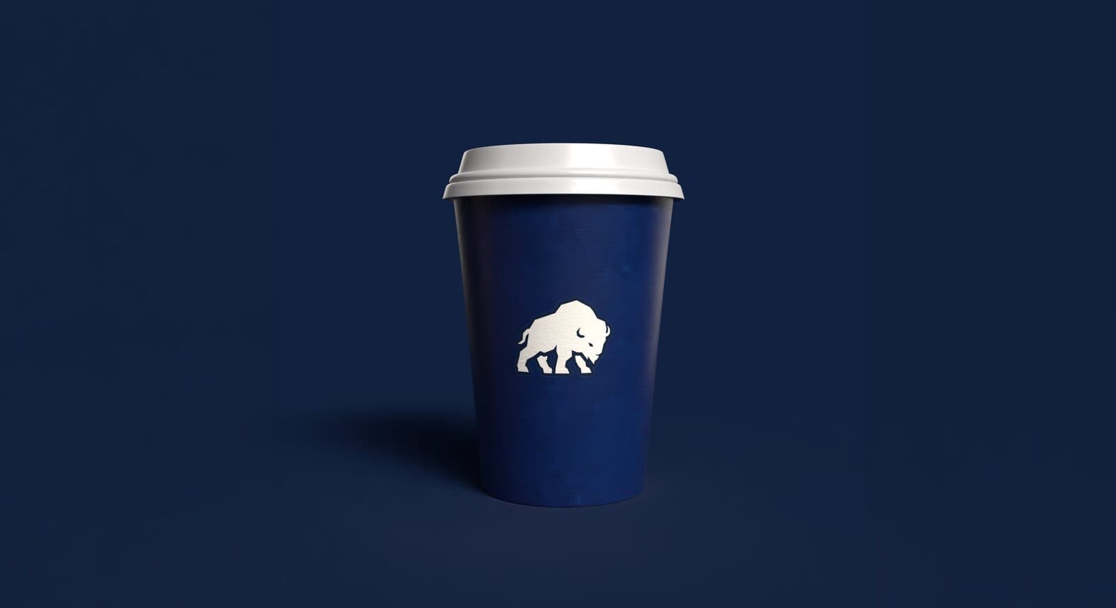
The logo system forms the foundation of the identity. The logotype is the brand’s primary typographic expression; the logomark, the bison, is its shorthand symbol, used when the full logotype isn’t practical or the brand is already clear in context; and the lock-up fixes the relationship between the two for formal applications.
Colour
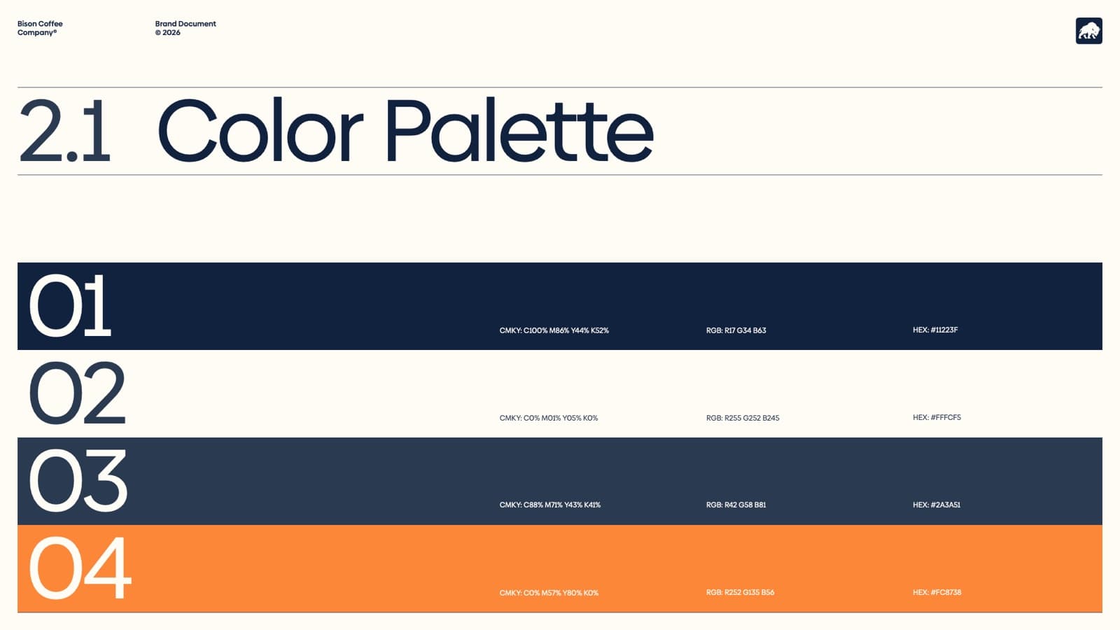
Colour defines mood, presence and recognisability. Four colours, with Bison Blue (#11223F) leading most applications and defining the brand’s overall mood, paired with its neutrals and a warm orange accent.
Typography
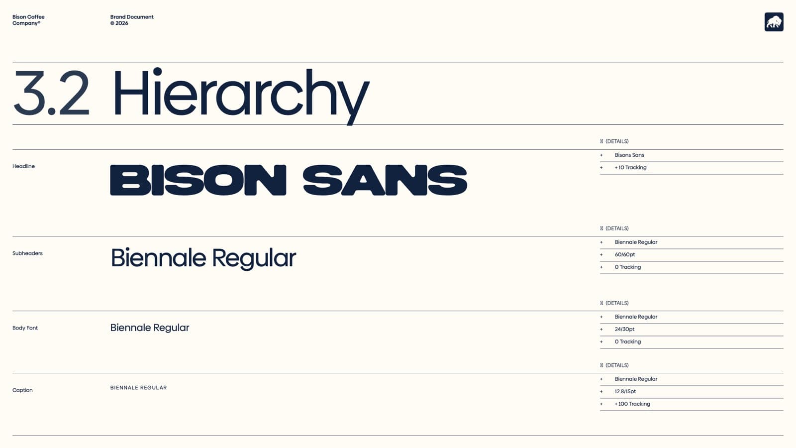
Bison Sans is the primary typeface across all brand communication: a bespoke face for headlines and bold communication, never body copy. Biennale Regular carries the subheads, body and captions.
Packaging
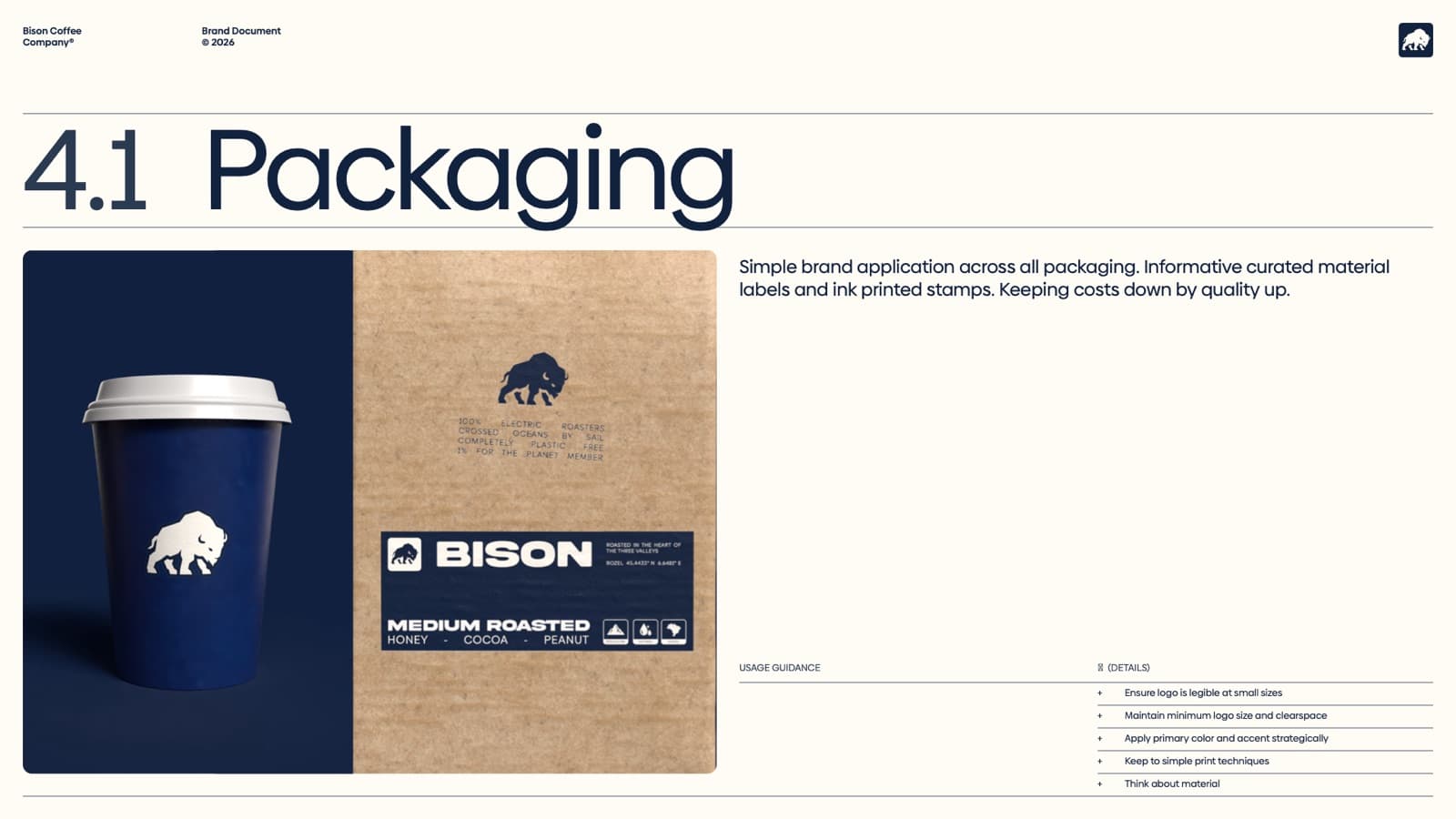
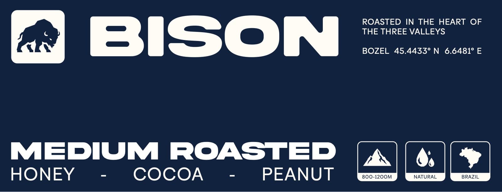
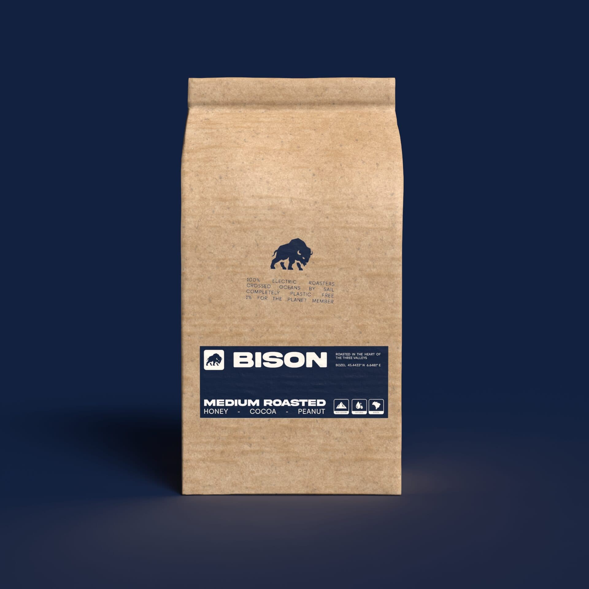
Simple brand application across all packaging: informative, curated material labels and ink-printed stamps. Keeping costs down but quality up.
Icons
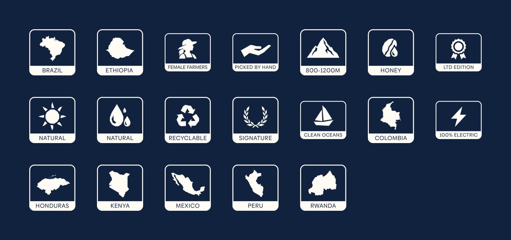
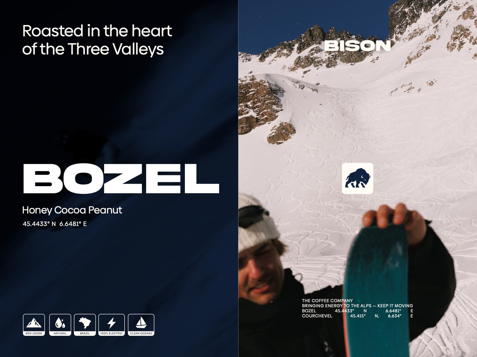
A set of icons for the labels: where each coffee comes from (Brazil, Colombia, Ethiopia, Honduras, Kenya, Mexico, Peru, Rwanda), how it's grown and processed (800 to 1200m, natural, honey, picked by hand, female farmers), and what the company stands by (100% electric, clean oceans, recyclable).
What it stands for
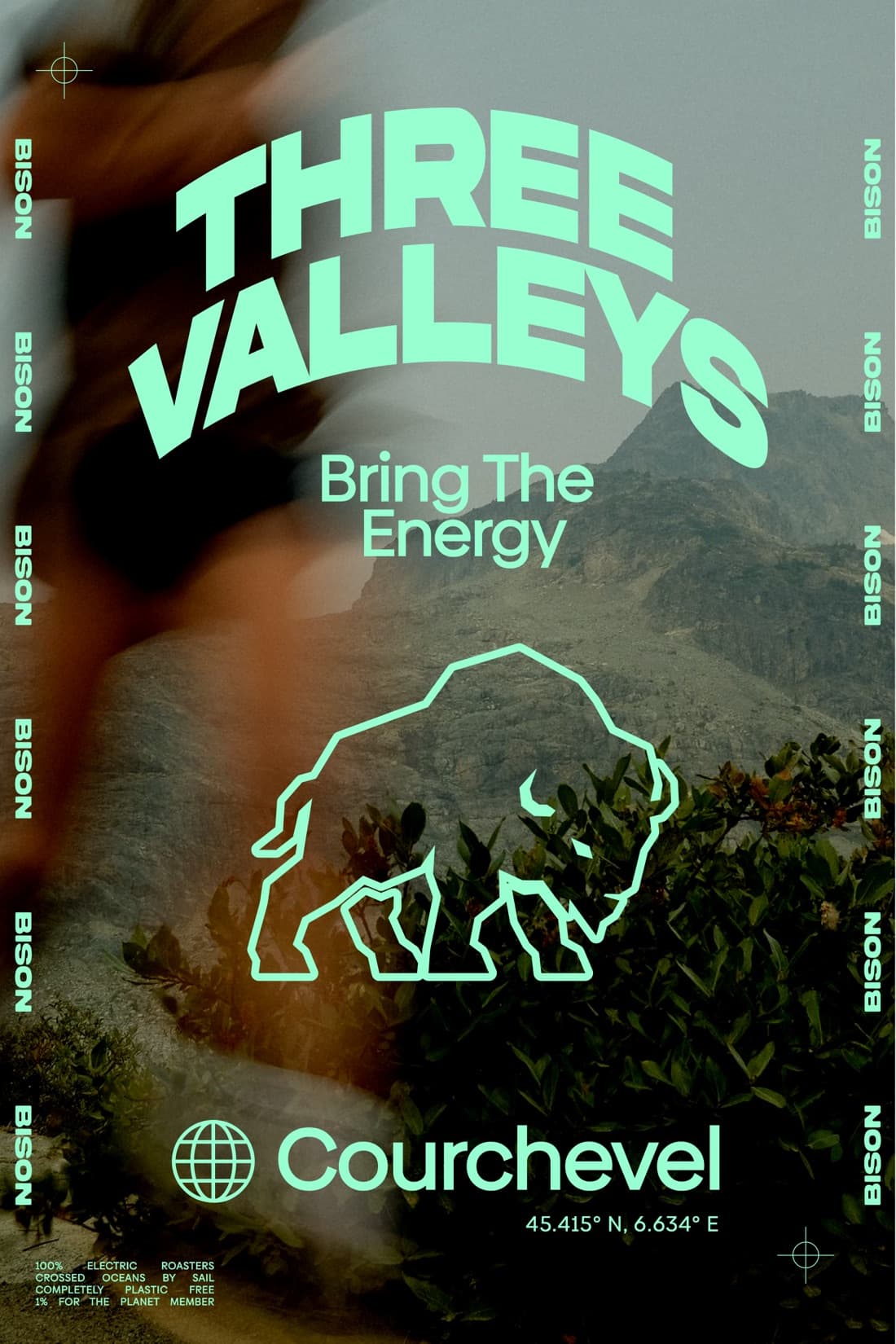
100% electric roasters. Crossed oceans by sail. Completely plastic free. A 1% for the Planet member.
Socials, ads and posters
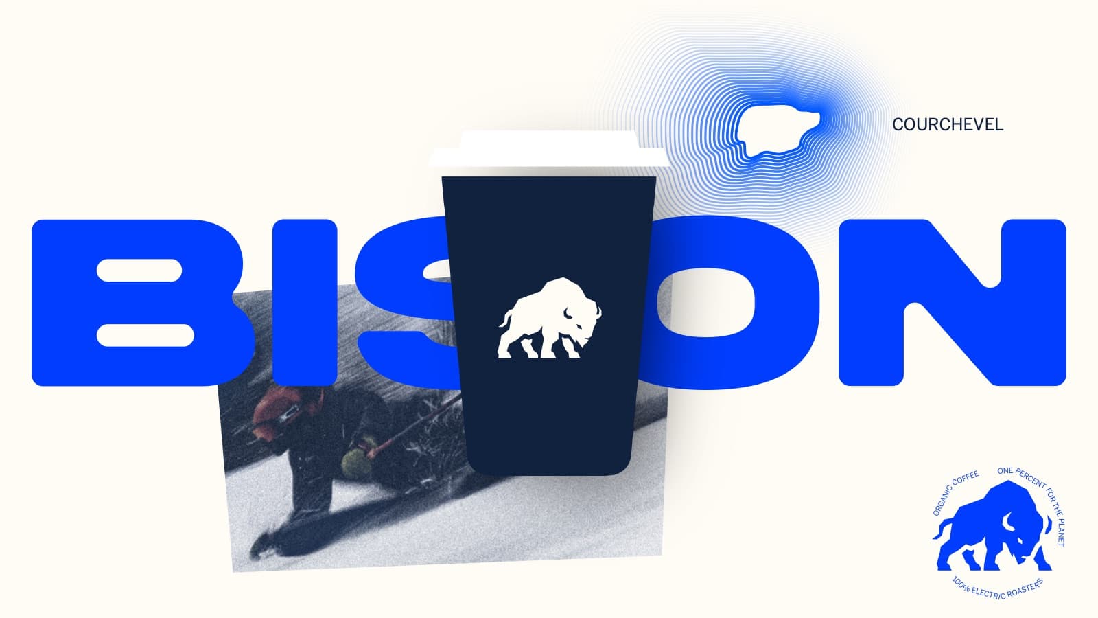
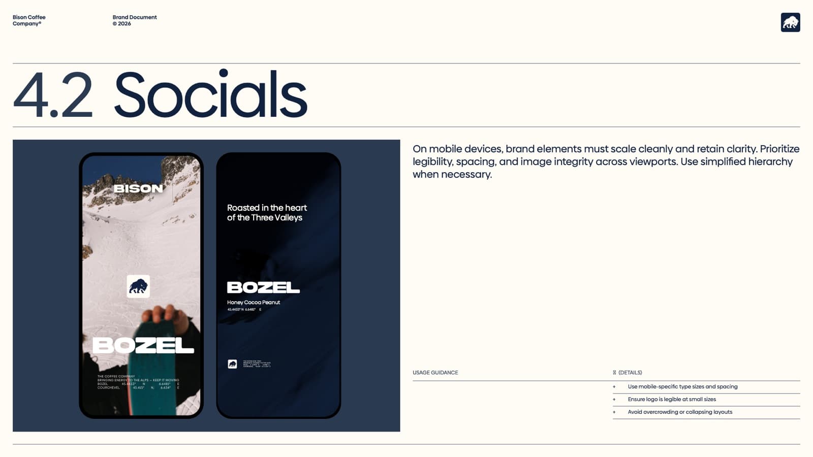
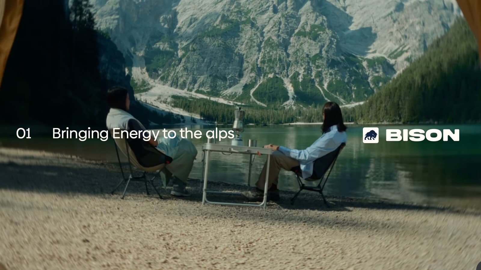
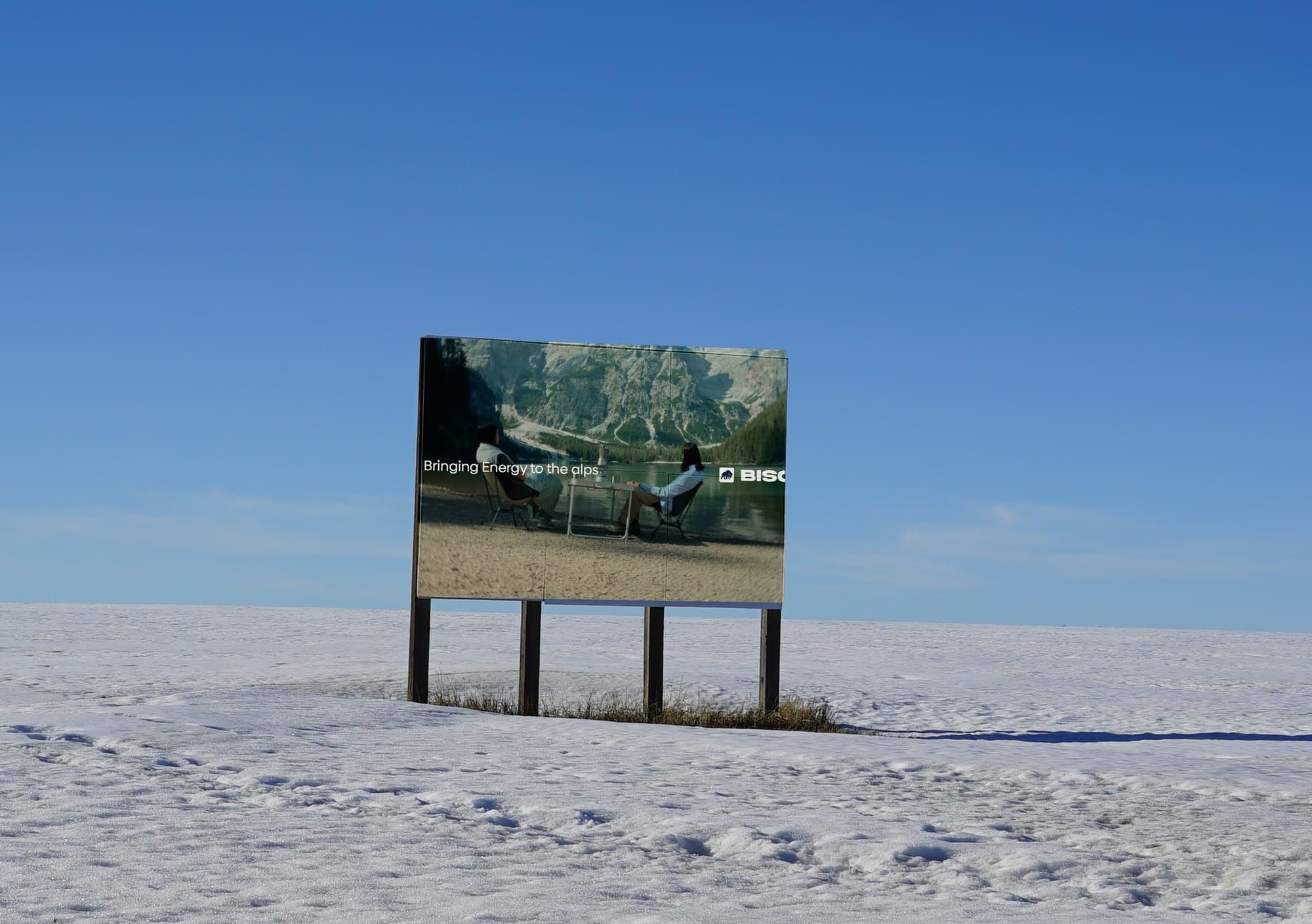
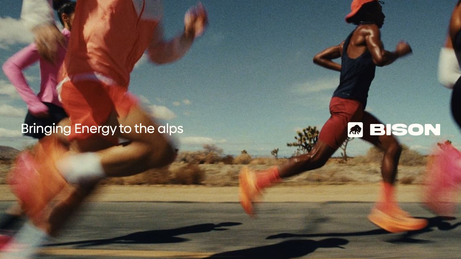
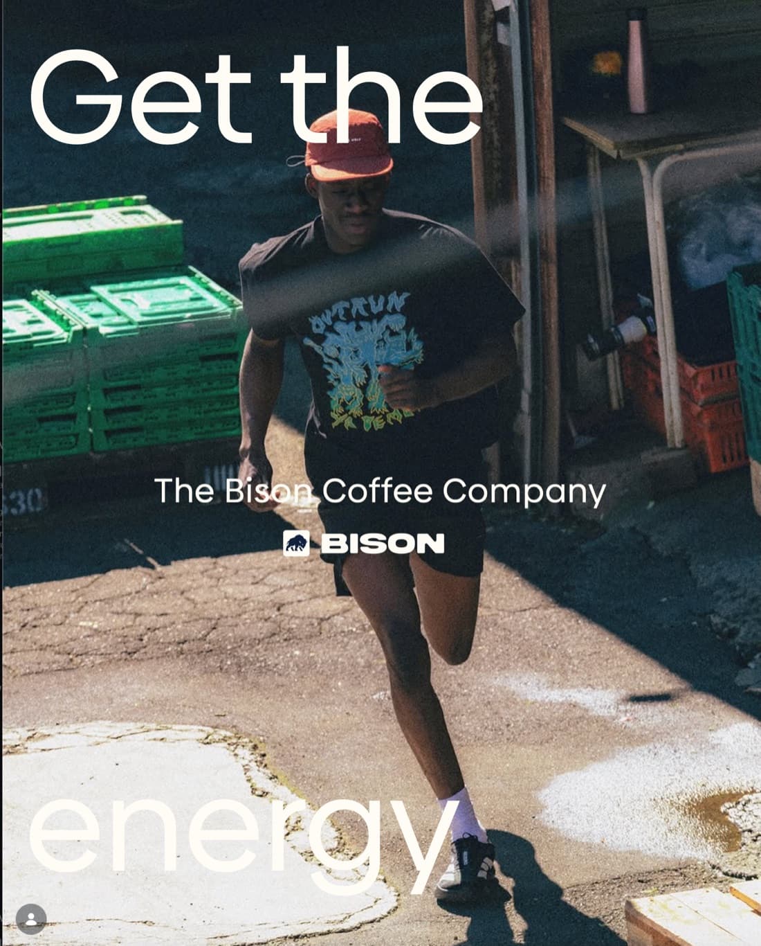
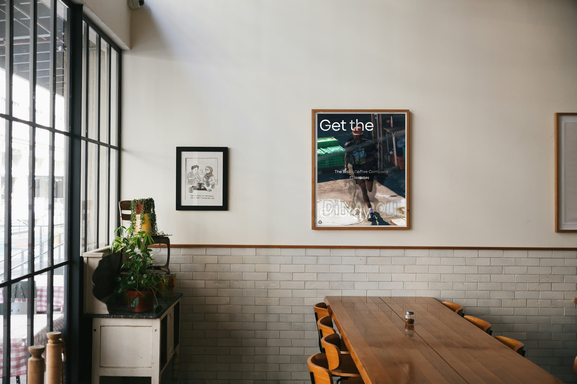
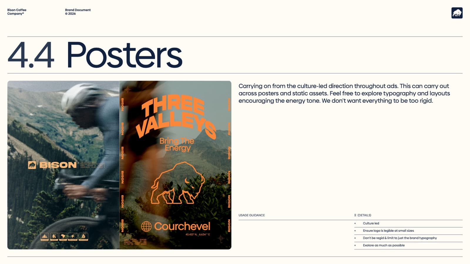
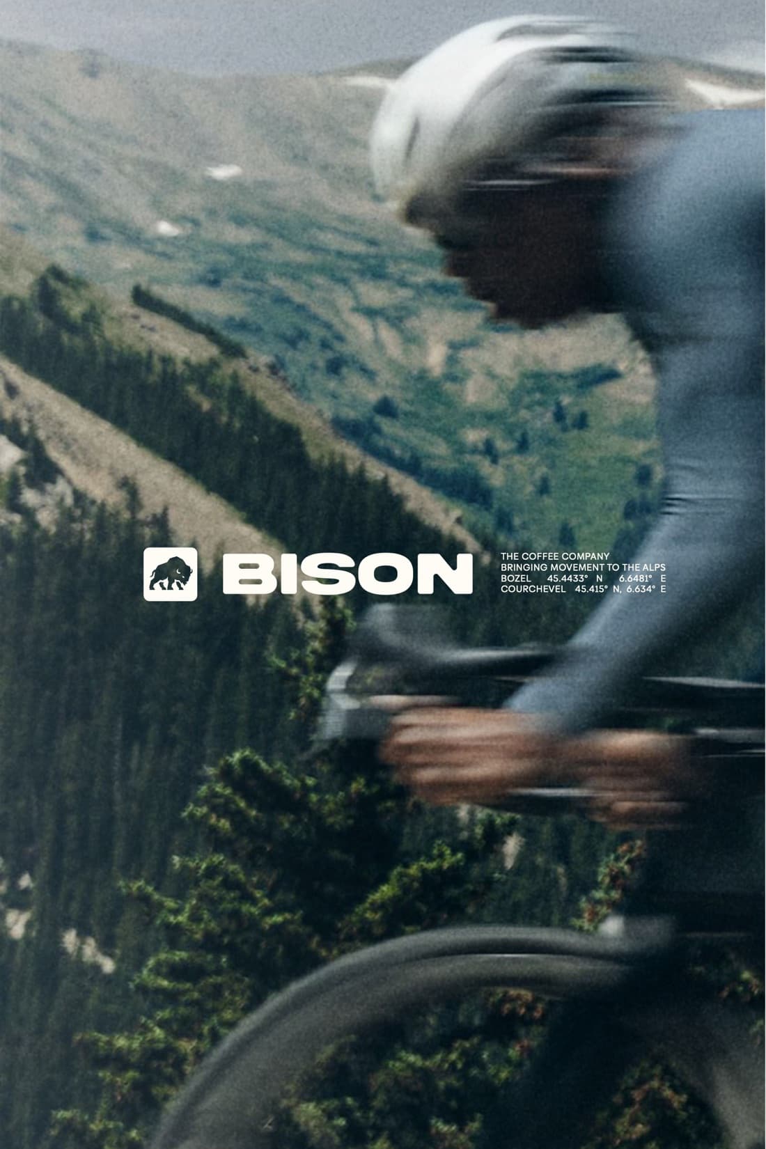
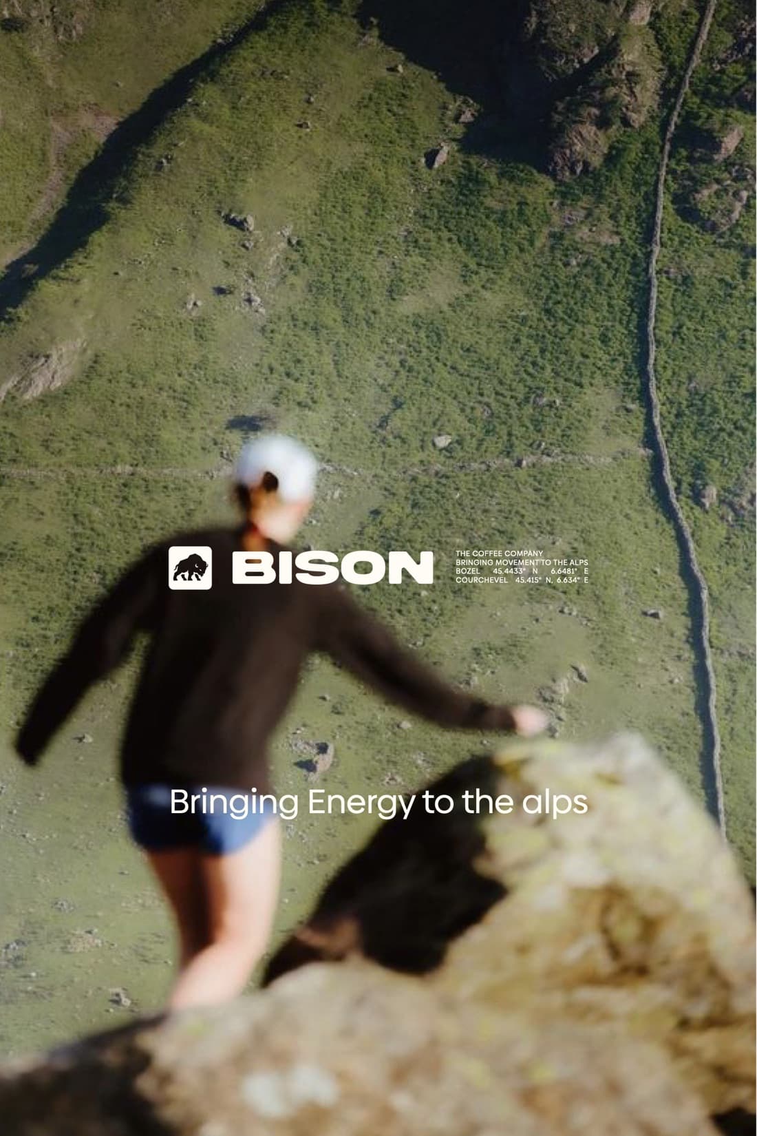
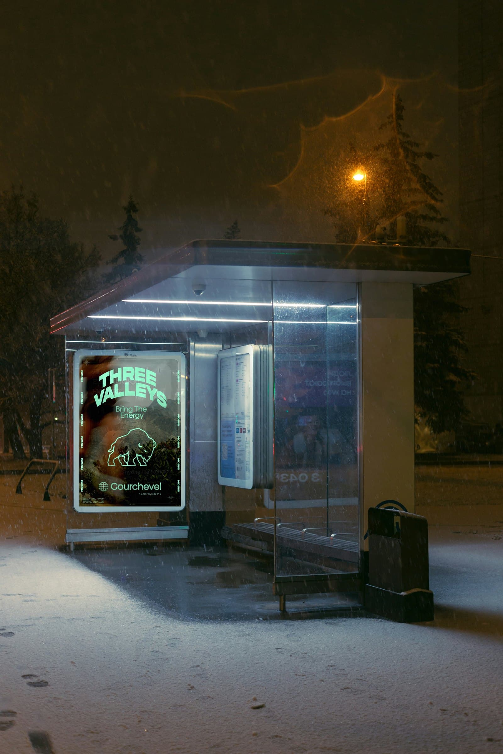
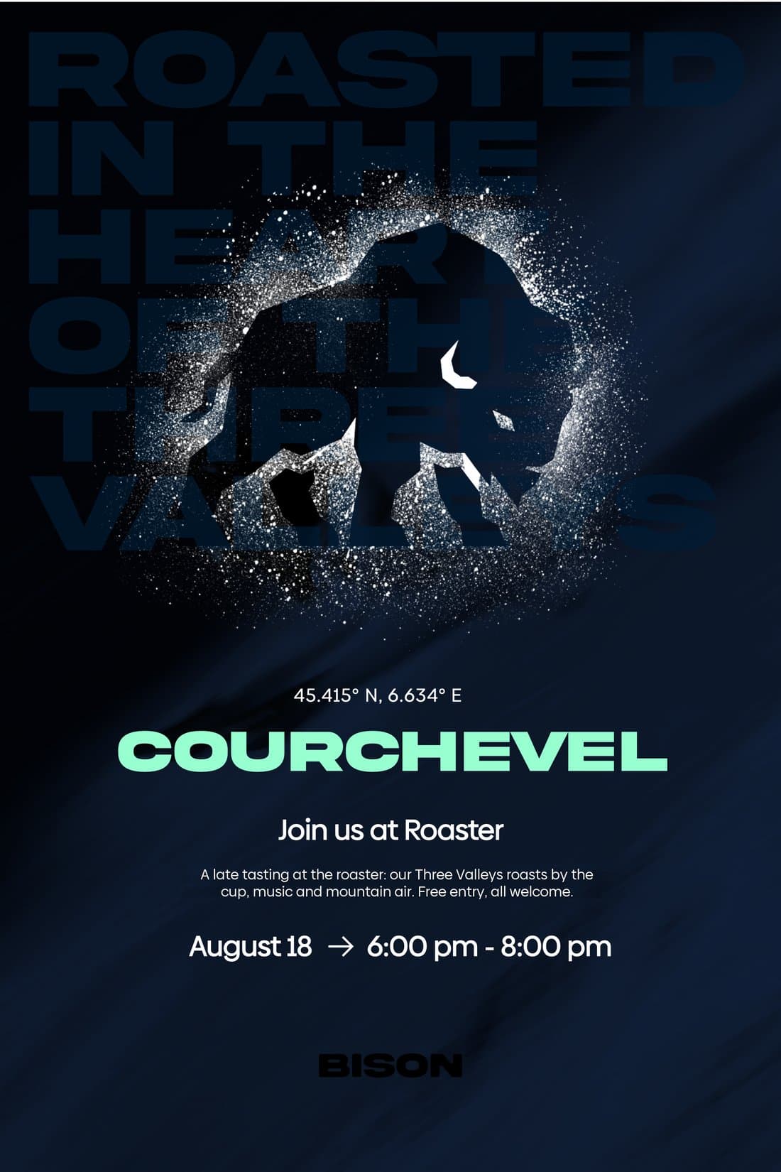
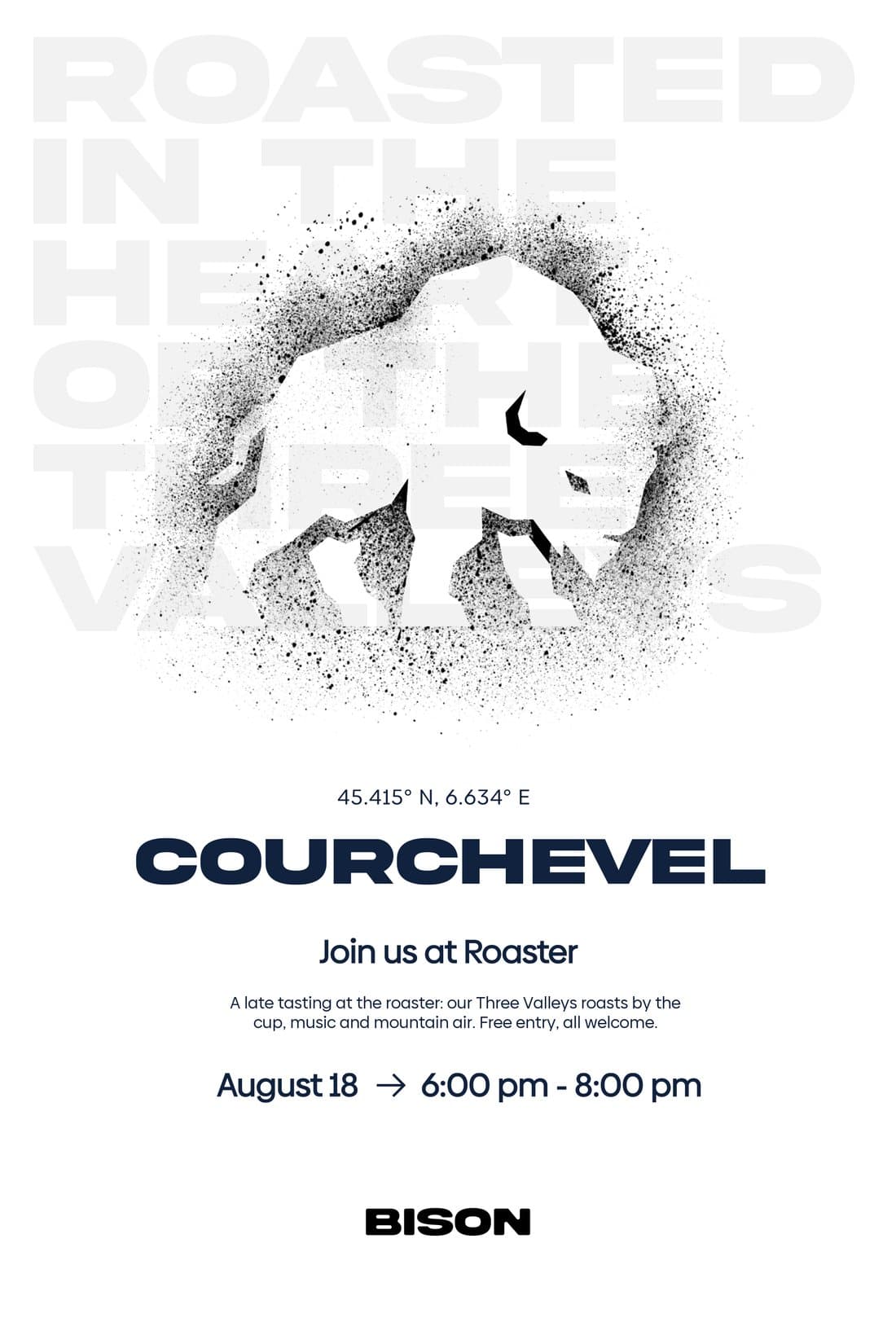
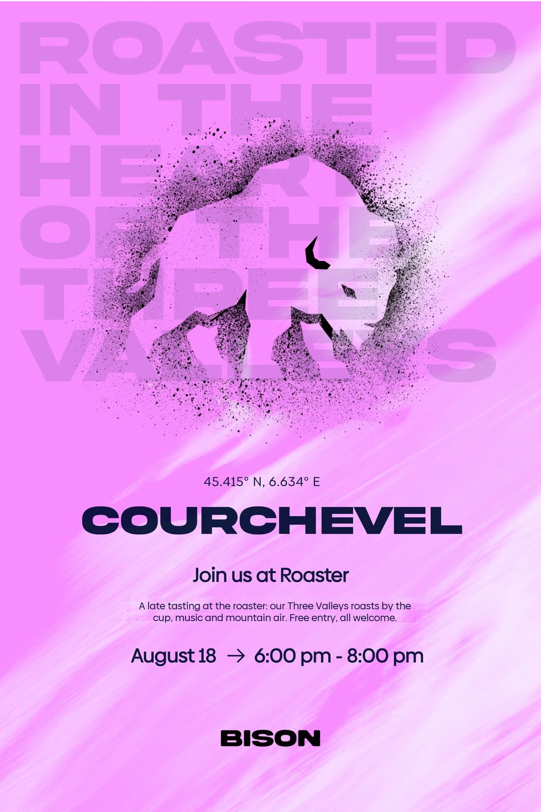
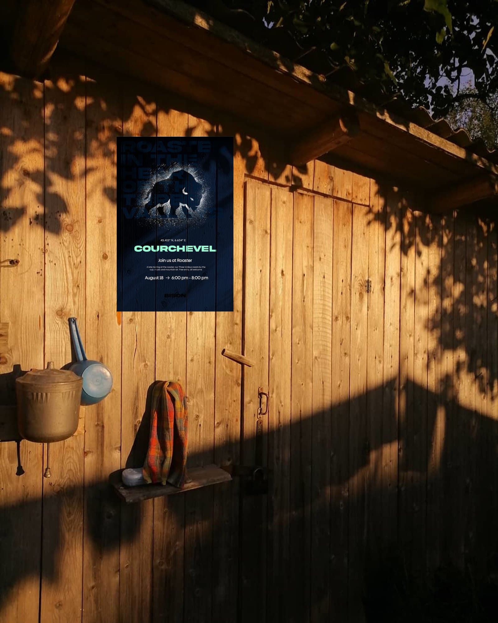
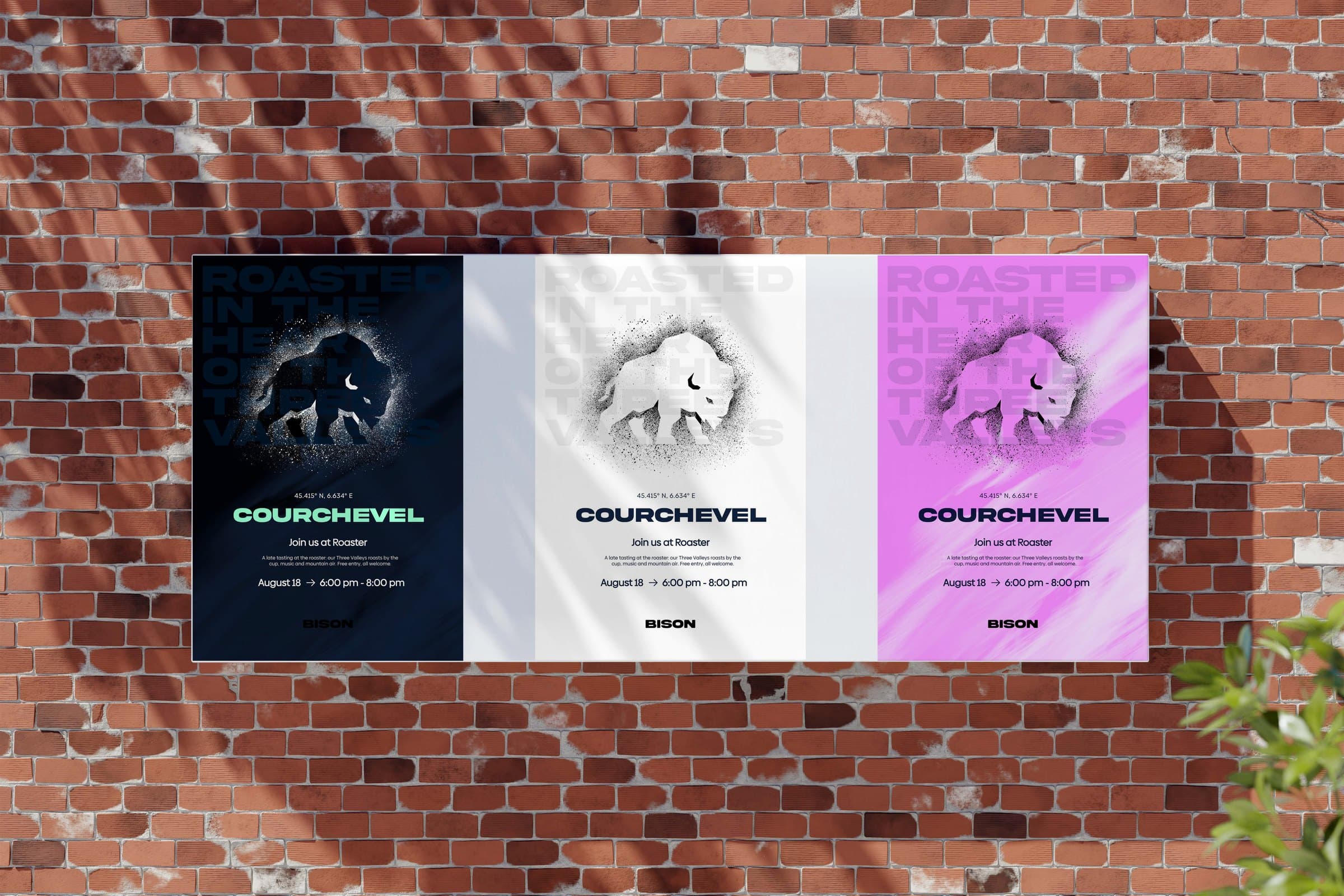
Culture led, with Bison signing off. On socials the brand scales cleanly to small screens; the ads let the story talk; and the posters carry the direction on, free to explore typography and layout in the brand’s energy. We don’t want everything to be too rigid.
Merch
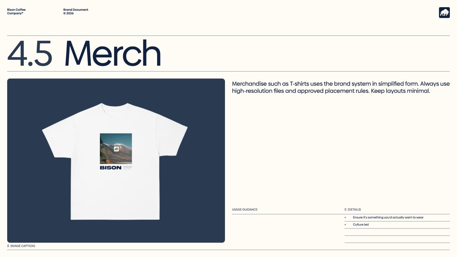
The brand system in a simplified form, minimal layouts: something you’d actually want to wear.
Imagery
Imagery with movement, blur and focus: authentic and true to the culture, in natural light and neutral tones, with room for the brand to breathe. The product speaks for itself, placed in natural situations: the roasting, being packed up, out in the wild.
- Bison Blue #11223F
- #2A3A51
- #FC8738
- #FFFCF5
Type: Bison Sans (bespoke), Biennale
- Mock-up scenes
- Max Sokol, Leonid Altman (Pexels); Ivan Baton, Manki Kim, Earl McKenzie (Unsplash)
- T-shirt model
- “T Shirt” by Nour, poly.pizza, CC BY 3.0 (posed)
Next: Brewed by Boon