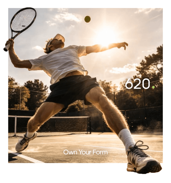
620. Tennis
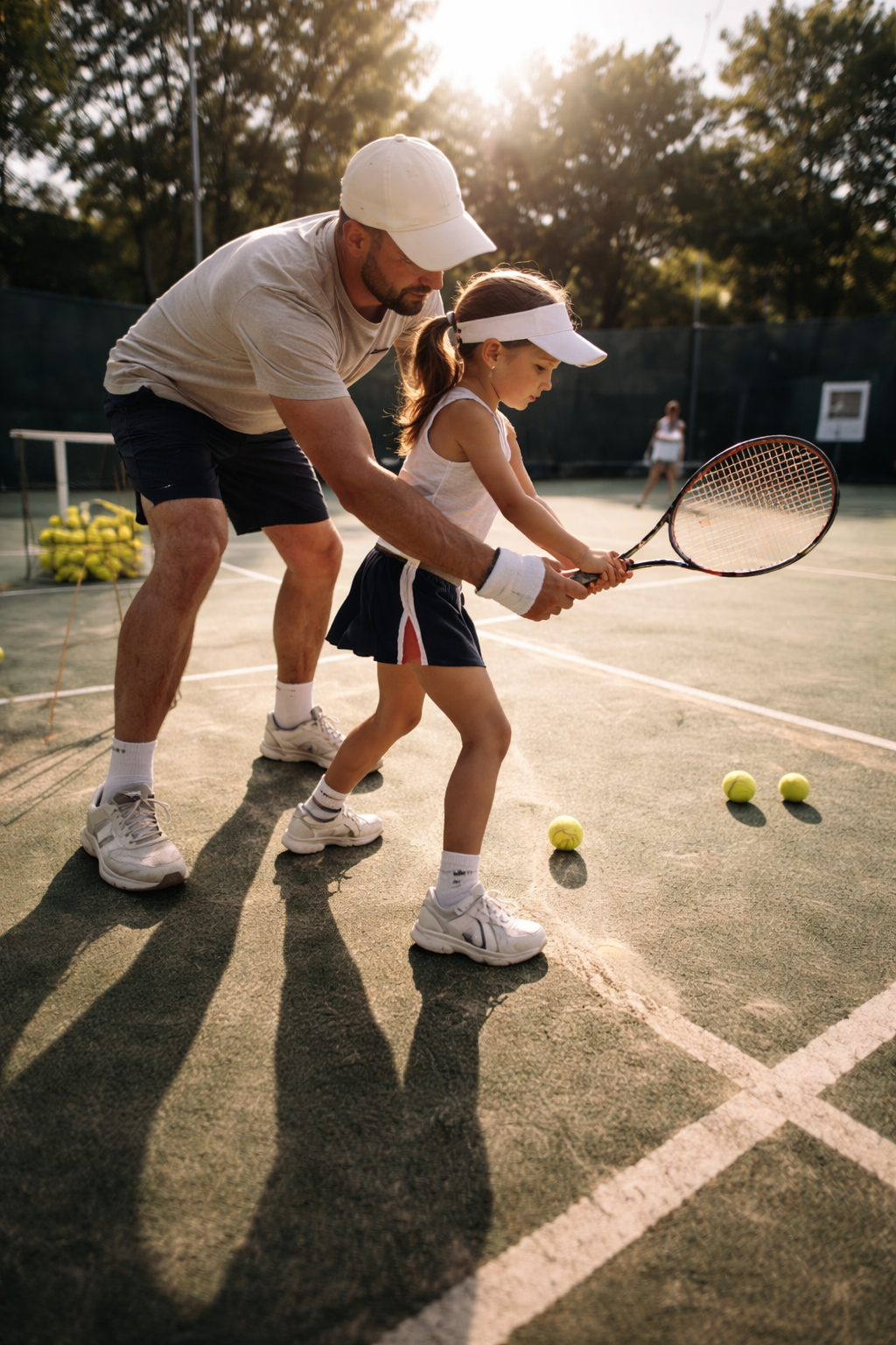
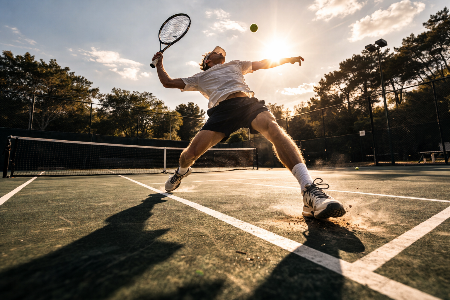
How do you build excitement around tennis coaching for all ages
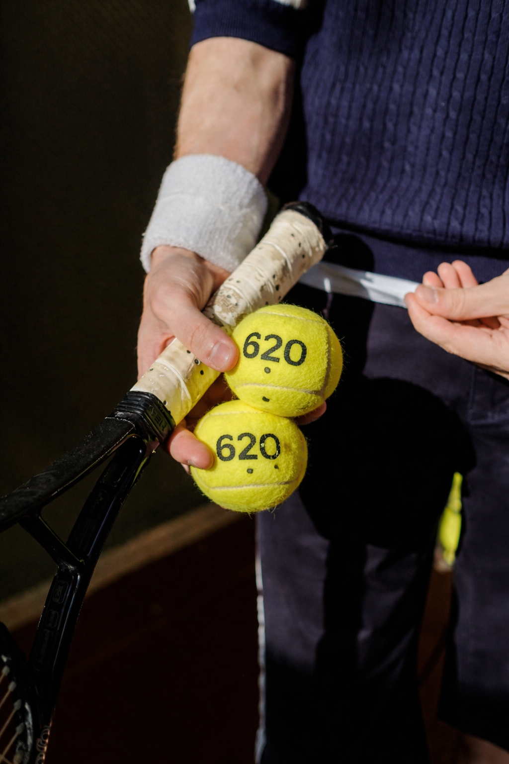
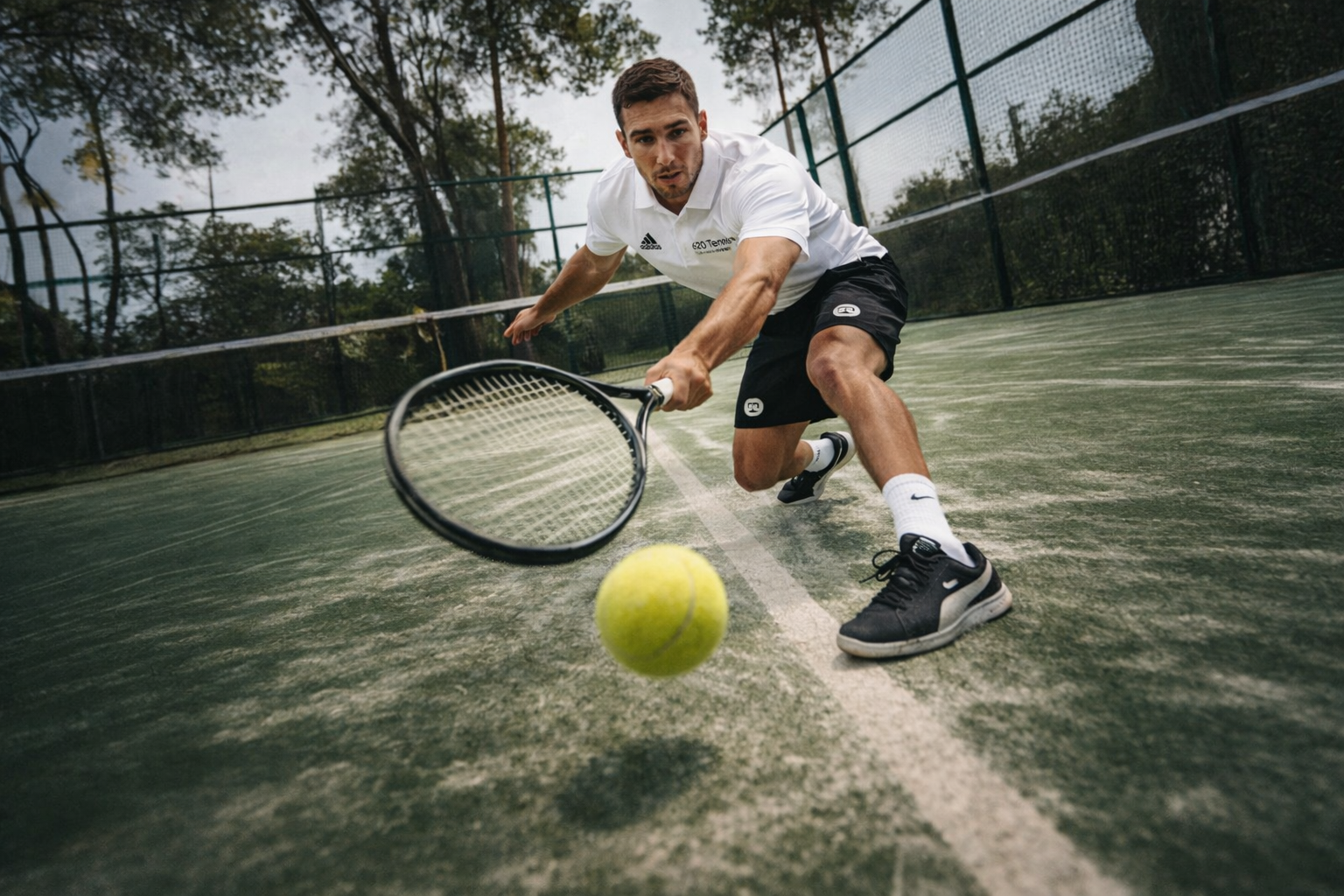
Created as a tennis-focused brand aimed at schools and young players, the identity needed to balance performance with approachability. It had to feel credible enough for serious training, yet welcoming for children just stepping onto the court for the first time.
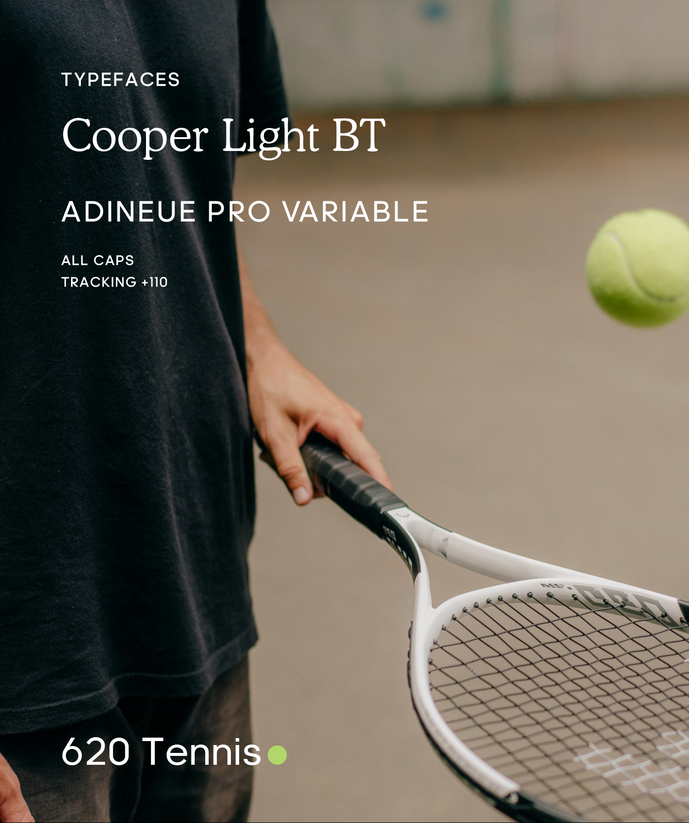
The direction centred around clarity and structure. Clean typography. Confident spacing. A refined visual system that feels disciplined but not intimidating. Strong enough to carry authority in a school environment, while still feeling energised and inclusive.
What we did
Brand Identity, Logo Artwork, Tone of Voice, Art Direction & Photography
Industry
Sports & Fitness
DARK GREEN
#133504
#B1D669
LIME GREEN
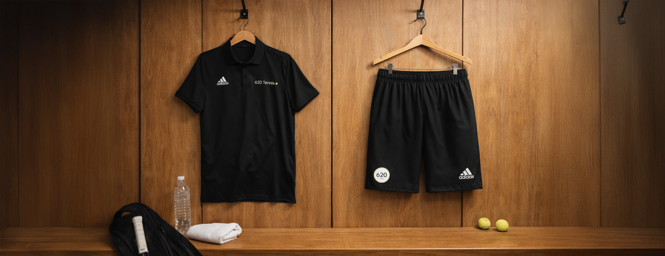
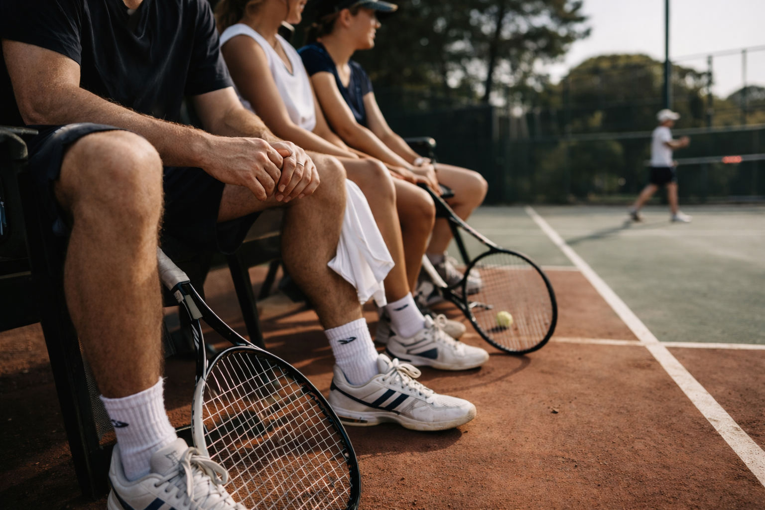
Uniforms
Comfort and practicality were key. These are pieces worn daily, on court and around campus, so they were designed to move well, last well, and maintain a sharp appearance throughout the day.
The result is a uniform that reflects leadership. Confident, without shouting.
COLLABORATION WITH
More work
-
![A person standing in front of a wall with a sign that reads 'Tied Oats Club,' with other people nearby.]()
Tired Oats Club
Branding – Art Direction
-
![Two motocross racers wearing helmets and numbered gear riding on a dusty dirt track.]()
Royal Enfield - Women of Motoverse
Editing – Social Content
-
![A young man with tattoos on his arm lying in bed, holding a smartphone, and looking at the camera.]()
headache – Music Visuals
Art Direction – Animation
-
![Close-up of a white vehicle with black text that reads 'brewed by' and orange graphic shapes. Part of a pink flower and shadows of leaves are visible on the side.]()
Brewed by Boon Coffee
Branding – Creative Direction – Social Content
-
![Close-up of white peony flowers with dark green leaves in the background, and a white letter 'K' overlay in the center.]()
Komorbi CBD
Art Direction – Branding – Social Content – Web Design
-
![A man and woman sitting outdoors near power lines, both holding a portable speaker, with the woman wearing headphones. The man has tattoos on his face and hand, and the woman has long dark hair and multiple rings.]()
The Hunna
Film – Art Direction – Social Content