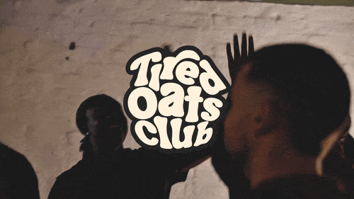
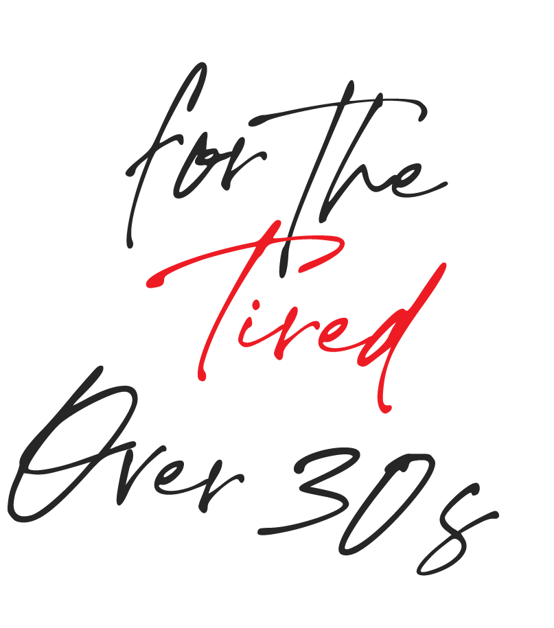
Tired Oats Club
How do you build an inclusive community with trusted products
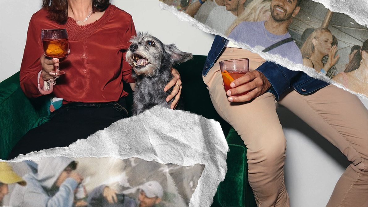
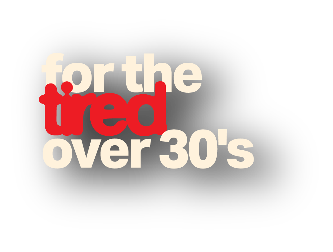
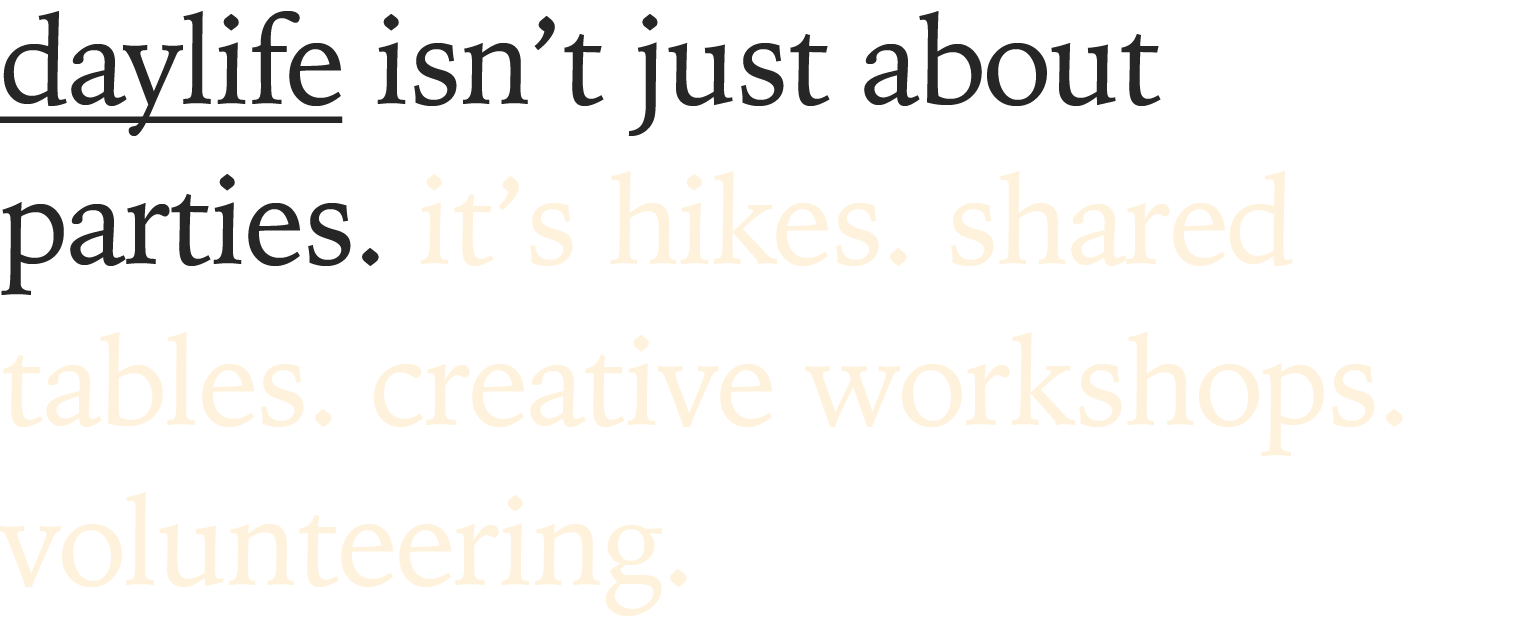
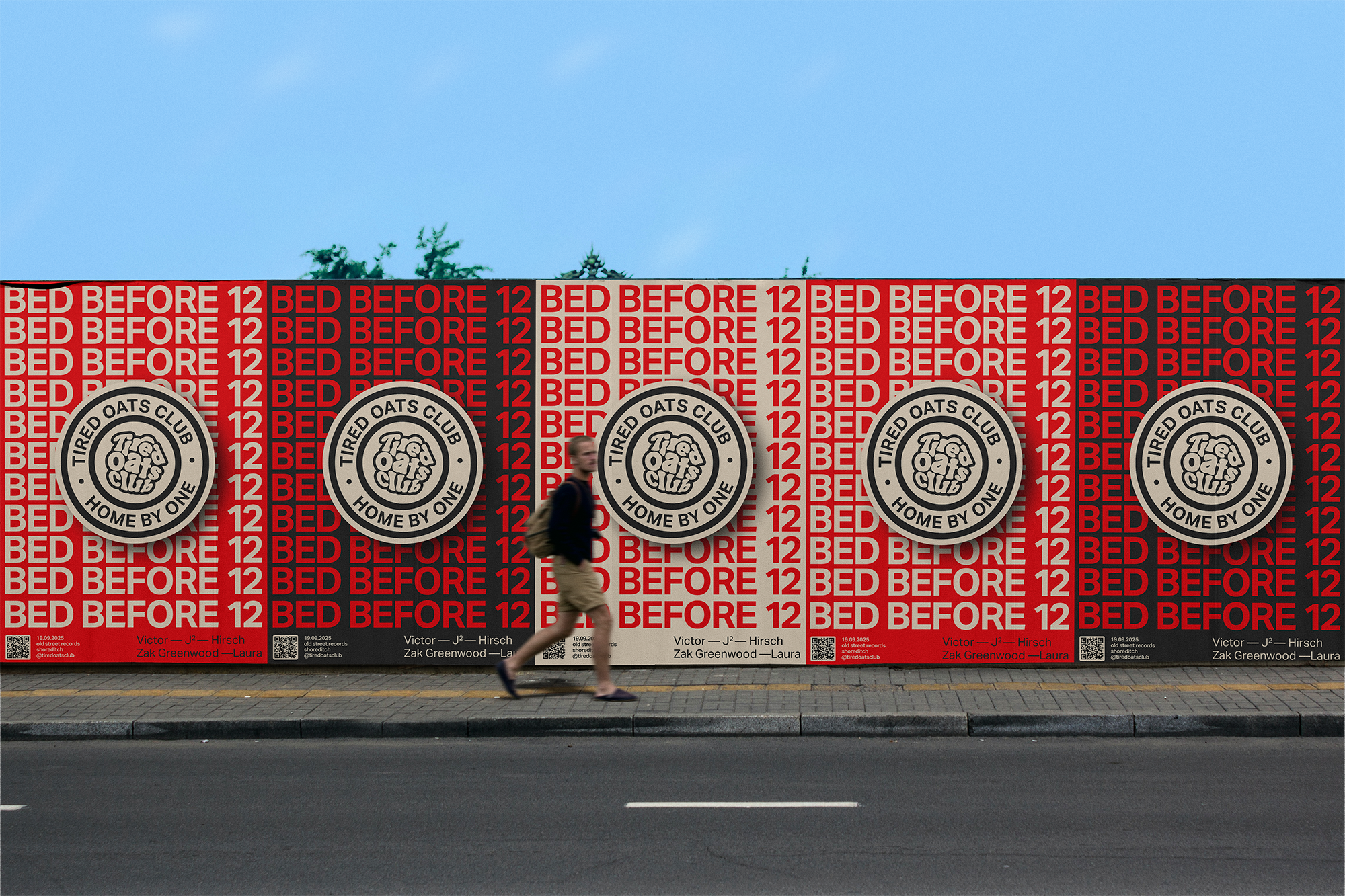
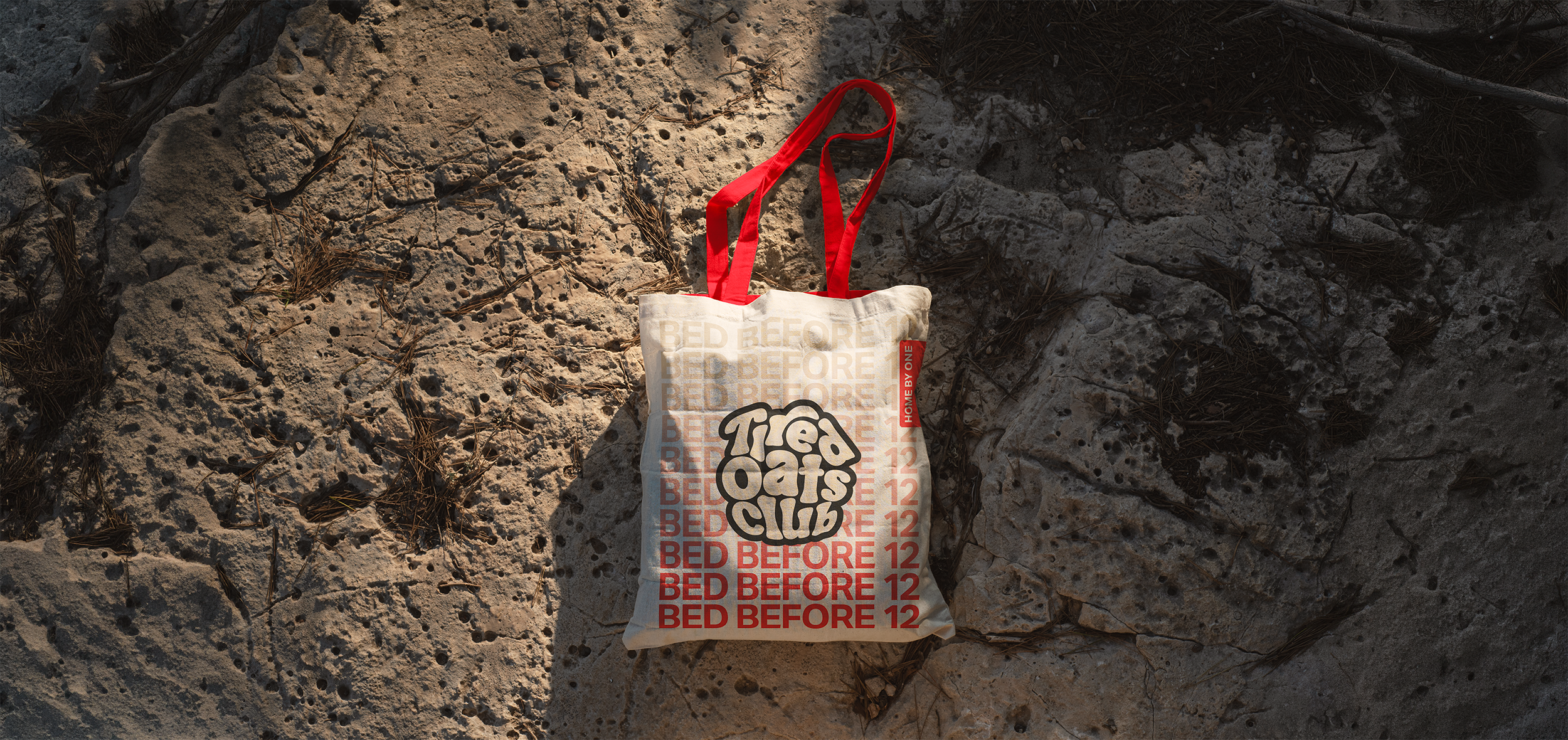
Following Tired Oats Club’s ethos of creating nightlife experiences that don’t compromise the day after, we developed a bold, modular visual identity that reflects the brand’s energy and reimagined daylife culture.
Stripping back to essentials, the system centres on confident typography, raw & expressive imagery and is designed to flex seamlessly across digital and physical touchpoints.
What we did
Verbal Identity, Product Design, Brand Identity, Logo Artwork, Art Direction, Tone of Voice including for AI assistant., Brand Strategy, Digital Design, Art Direction & Photography
Industry
Social & Nightlife

Logo
Typography


Colours
Dark Grey
#262626
Off-White
#fff2dc
Party Red
#ed1c24
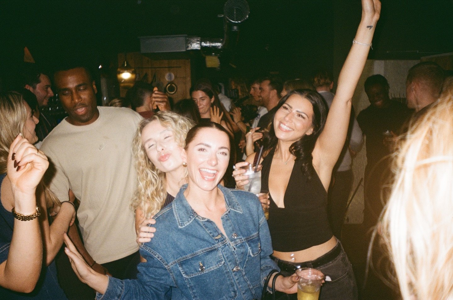
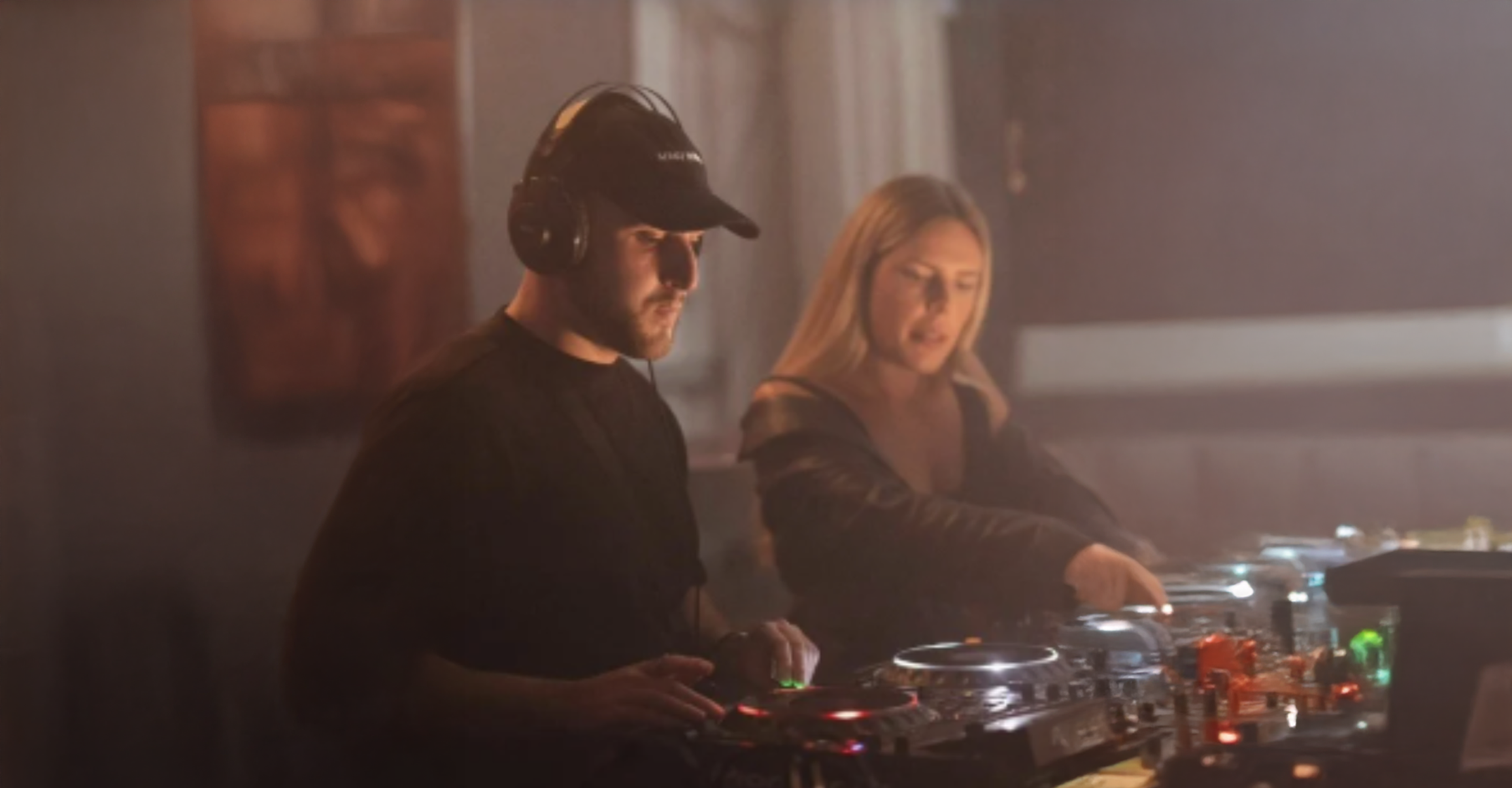
Social
Expanding on an already established platform we built a strategy to infuse content like new product launches to latest health information. Keeping the core messaging around trusted, truthful information rather than to simply sell products.
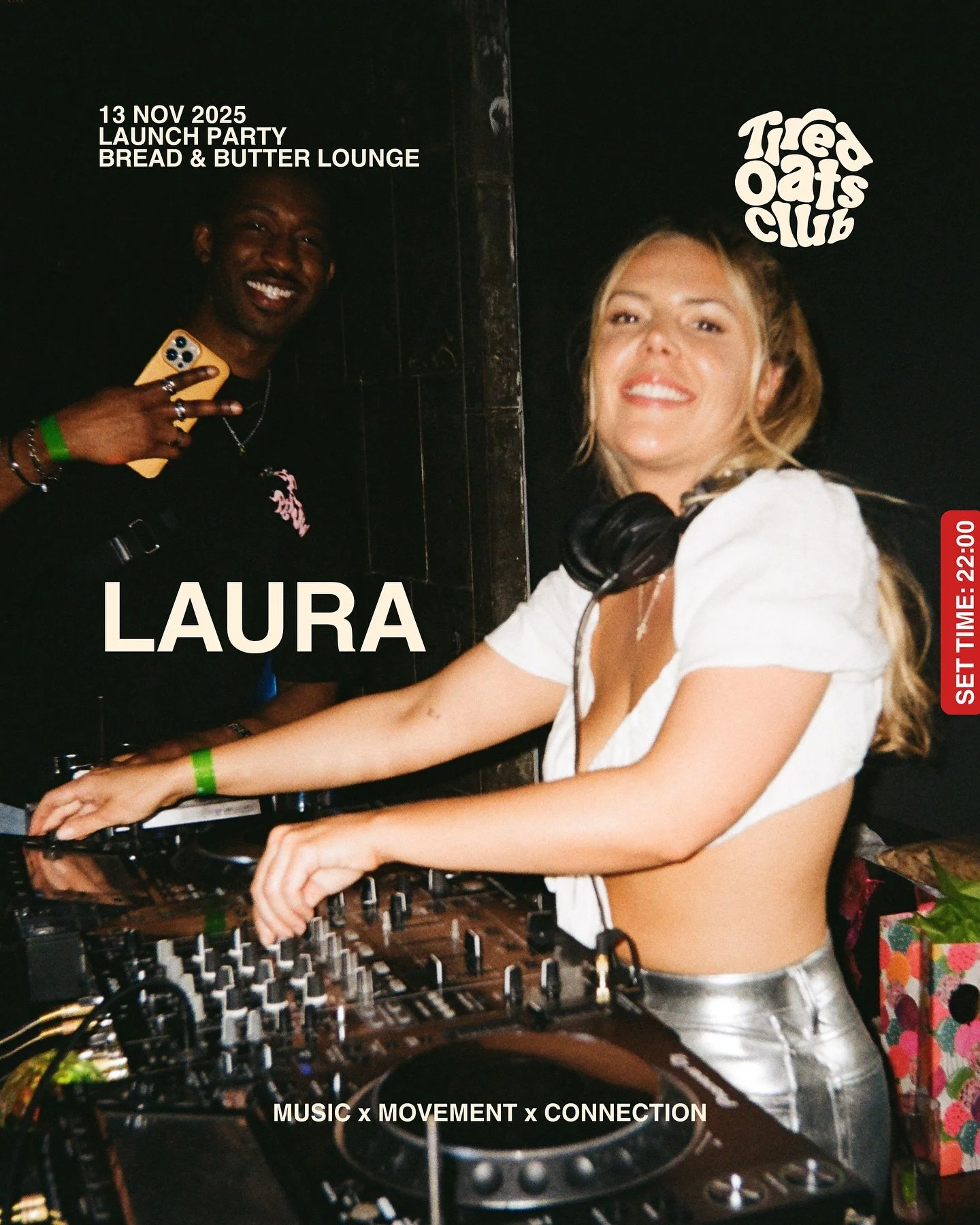
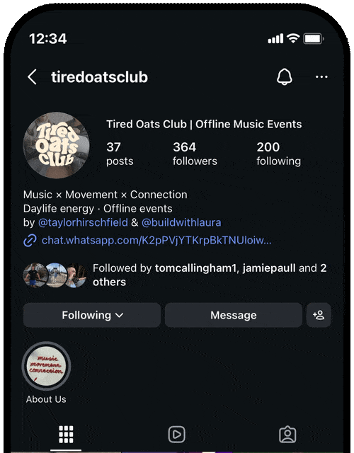
@tiredoatsclub
For moment’s that feel good the next day
music
movement
COLLABORATION WITH
More work
-
![A person standing in front of a wall with a sign that reads 'Tied Oats Club,' with other people nearby.]()
Tired Oats Club
Branding – Art Direction
-
![Two motocross racers wearing helmets and numbered gear riding on a dusty dirt track.]()
Royal Enfield - Women of Motoverse
Editing – Social Content
-
![A young man with tattoos on his arm lying in bed, holding a smartphone, and looking at the camera.]()
headache – Music Visuals
Art Direction – Animation
-
![Close-up of a white vehicle with black text that reads 'brewed by' and orange graphic shapes. Part of a pink flower and shadows of leaves are visible on the side.]()
Brewed by Boon Coffee
Branding – Creative Direction – Social Content
-
![Close-up of a young woman with red hair, dark lipstick, septum piercing, and intense expression, outdoors with sunlight in the background.]()
Mary Wyatt x Download '24
Film – Art Direction – Social Content
-
![Close-up of white peony flowers with dark green leaves in the background, and a white letter 'K' overlay in the center.]()
Komorbi CBD
Art Direction – Branding – Social Content – Web Design
-
![A man in motorcycle gear and helmet standing next to a motorcycle in front of a graffiti-covered wall and fence with a red 'Royal Enfield' logo and 'Scram City' text. 'Episode one' is written below.]()
Royal Enfield – Scram City
Editing – Social Content
-
![A person using an ATM machine outside a building with a bike parked nearby, viewed through a film strip style frame.]()
Paper Mill
Branding – Film – Animation – Merch
-
![A man and woman sitting outdoors near power lines, both holding a portable speaker, with the woman wearing headphones. The man has tattoos on his face and hand, and the woman has long dark hair and multiple rings.]()
The Hunna
Film – Art Direction – Social Content